|
Oftentimes when we are trading, we tend to focus on the near-term events and charts and ignore the bigger picture. This week I wanted to start with the very long-term charts and work our way towards the more recent events. Being a trend follower, before jumping into any trade I ask myself a very basic question: is the security I am about to trade bullish or bearish? Truly this is sometimes one of the toughest things to do in trading to simply figure out the very basic question: am I going to be buying the security in question or am I going to be selling (shorting) it. I use various methods to determine this including: various trend indicators, market breadth, bellwether stocks, etc. |
|
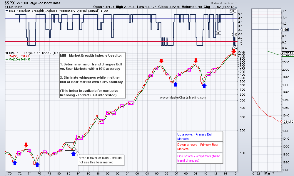
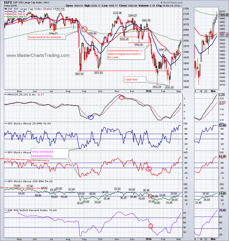
Lots of historical data is available for $SPX and I developed my own system to answer this basic question. The end result was the Market Breadth Index (MBI). In the backtesting, MBI was able to call the primary bull and bear markets with a 90% accuracy, while at the same time eliminating a vast majority of false trend changes. What does MBI tell us right now? MBI model is still pointing to the fact that stocks are in a primary bear market.
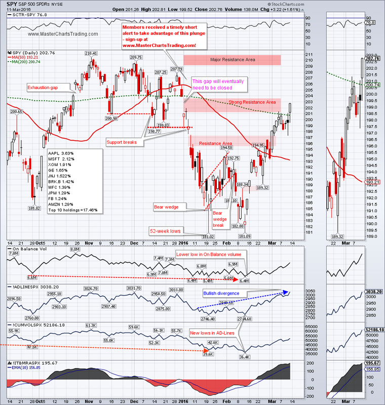
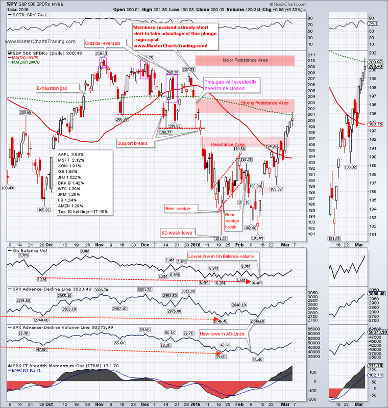
Since our basic question is now answered, we will now consider the medium-term condition. Medium term SPY has rallied off the 52-week lows set in February. On Friday, SPY managed to close above 200-day moving average and ended the week smack in the middle of the strong resistance area. This resistance is defined by the large gap-down from the first day of trading and the 200-day moving average.
In my view the current condition is significantly overbought, while SPY is in a primary downtrend. This is a recipe for the bears to step in.
CHART OF SPY
In my view the current condition is significantly overbought, while SPY is in a primary downtrend. This is a recipe for the bears to step in.
CHART OF SPY
Recently Tom McClellan put out an article entitled Highest McClellan Oscillator in 7 Years. Tom is a very respected technical analyst whose opinion I very much heed. As he pointed out, high McClellan oscillator readings could mean one of two things: initiation of a new trend, or a climax of the move.
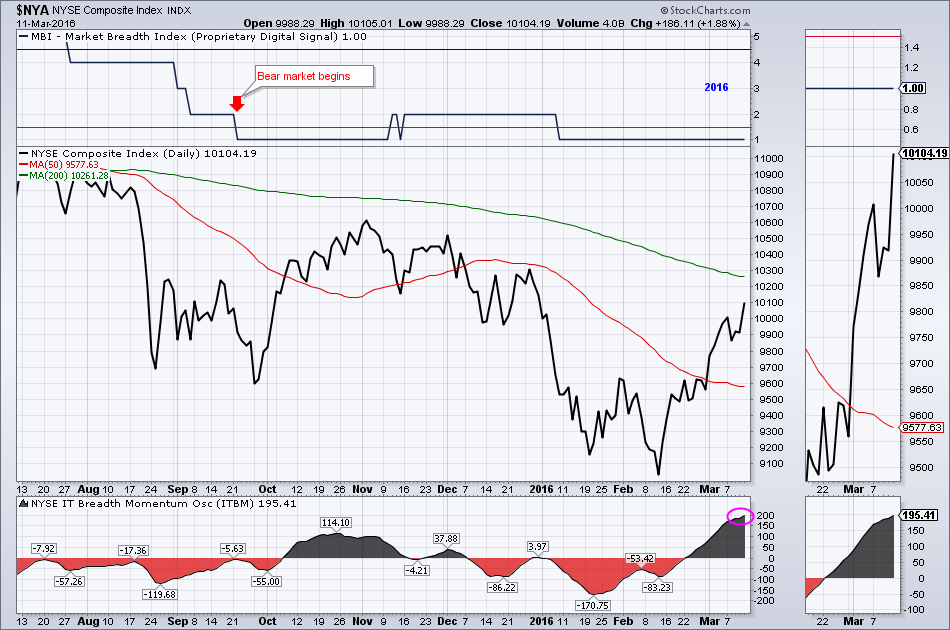
A version of the McClellan oscillator is Carl Swenlin’s Intermediate Term Breadth Momentum Oscillator (ITBM). ITBM has also registered a very high reading on Friday. Let us now examine what this high reading could mean in the context of the current bear market.
CHART OF $NYA
A version of the McClellan oscillator is Carl Swenlin’s Intermediate Term Breadth Momentum Oscillator (ITBM). ITBM has also registered a very high reading on Friday. Let us now examine what this high reading could mean in the context of the current bear market.
CHART OF $NYA
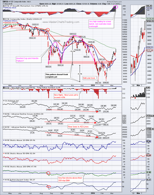
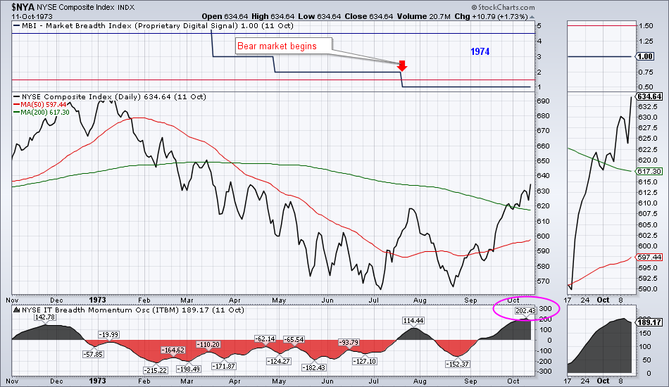
It turns out that similar high readings do happen during the bear markets. The bear market of 1973-1975 also registered a high ITBM reading. The chart below from 1973 illustrates what happened back then. After the high ITBM reading was registered, $NYA topped out and went on to loose an additional 46% over the next year before finally bottoming out a year later.
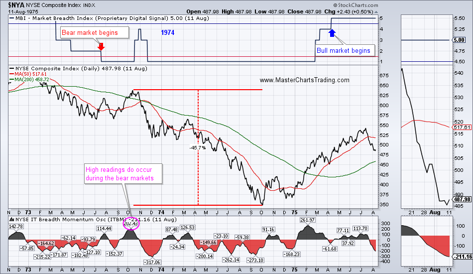
Current technical picture in $NYA looks somewhat more bearish then the one from 1973. Will this time be different? Anything is possible and I am keeping an open mind about a bullish outcome, but the probability of a bearish outcome is significantly larger.
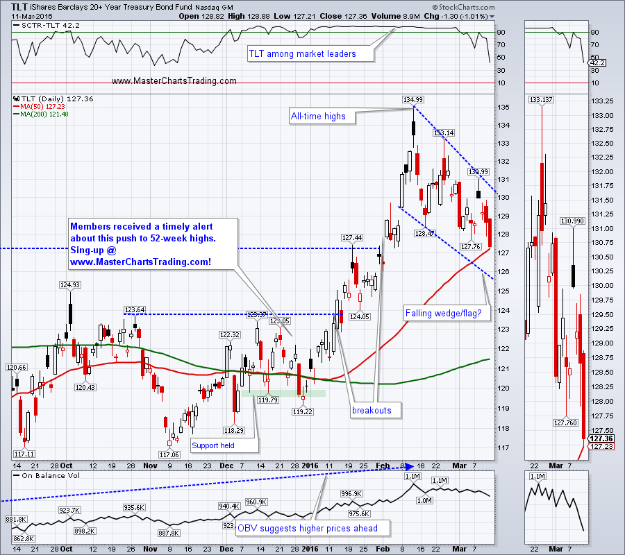
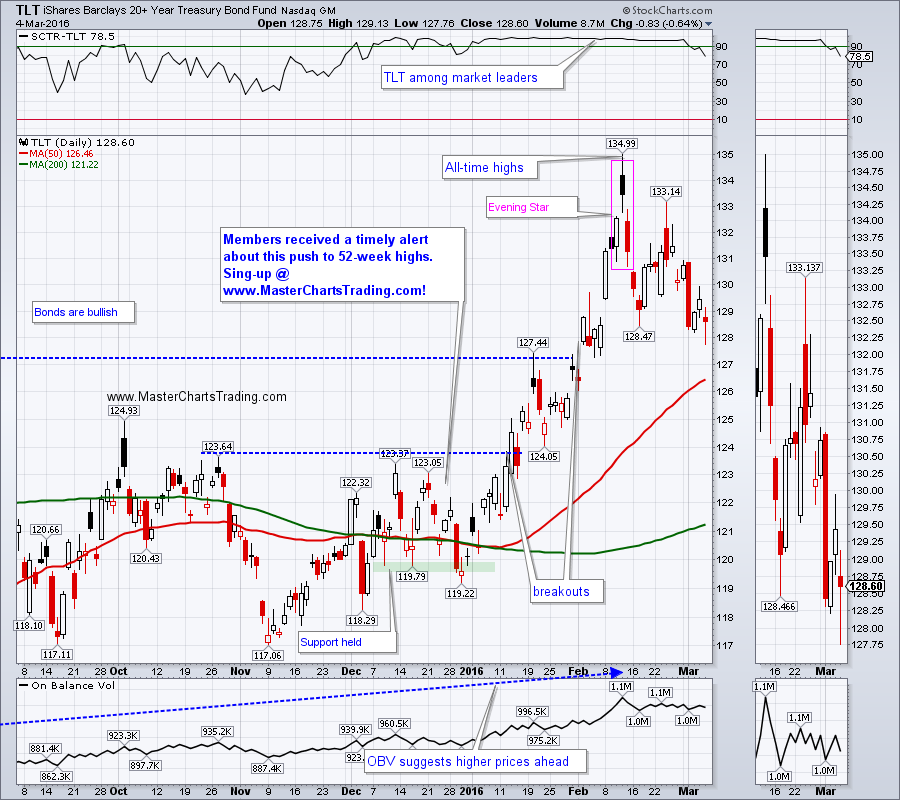
Bonds have been feeling the pressure of money rotating into the riskier assets and corrected to their breakout levels. TLT may be tracing out a falling wedge/flag of sorts. We all know that a falling wedge in the context of a bull market means – it’s a continuation pattern. After this pullback is over a break above $131 for TLT would likely mean a re-challenge of all-time highs set last month.
CHART OF TLT
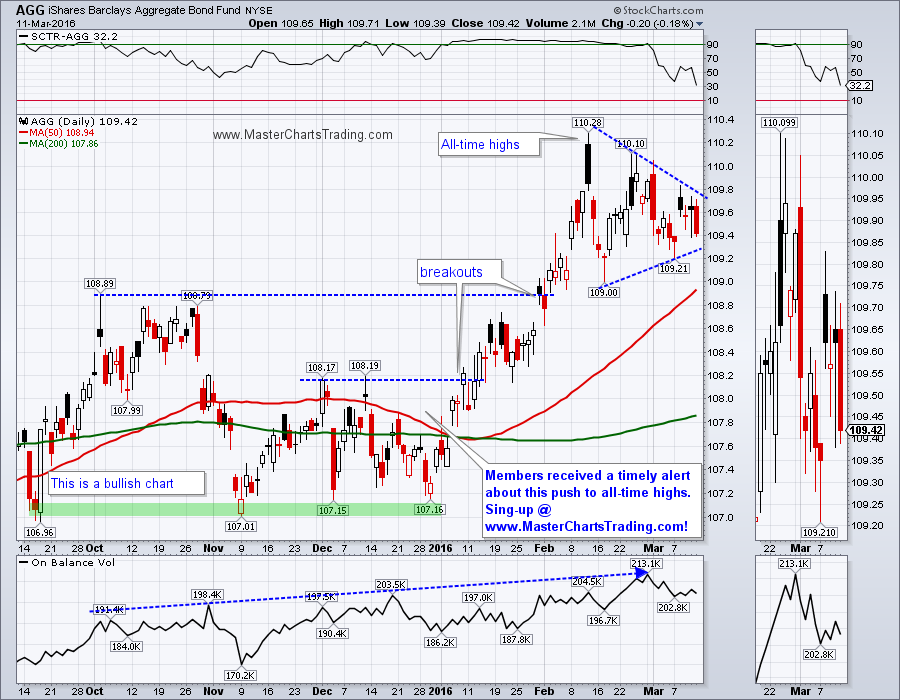
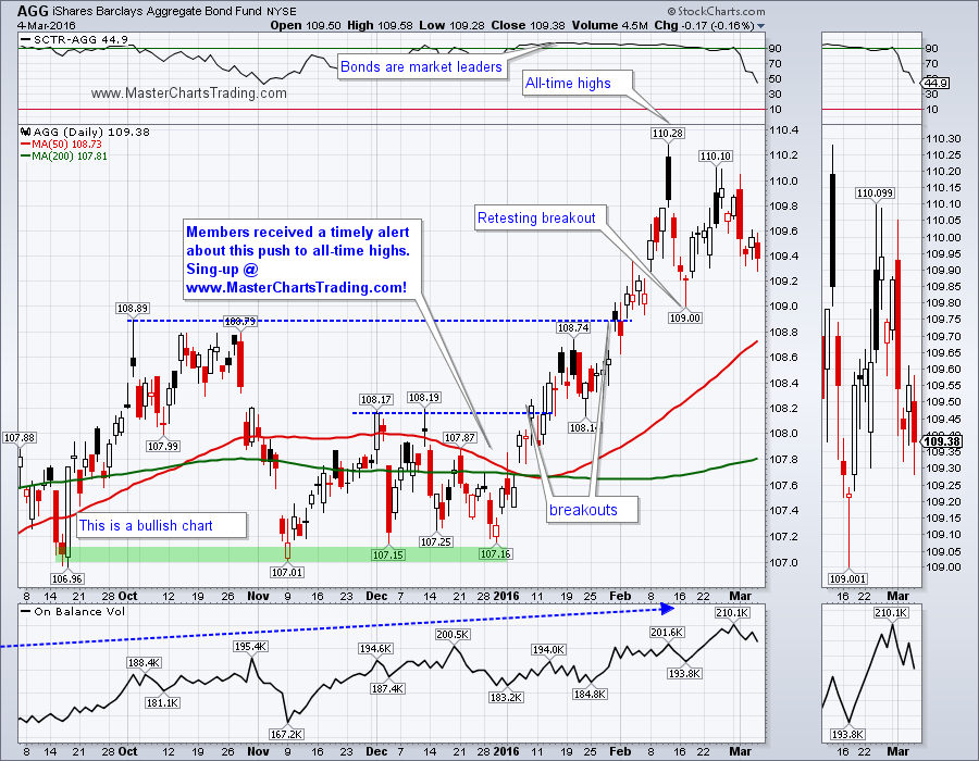
The diversified bond fund AGG looks even stronger then TLT and is still way above its breakout levels. AGG seems to be tracing out a pennant of sorts. Similarly to TLT, a breakout above $109.90 for AGG should lead to a retest of all-time highs.
CHART OF AGG
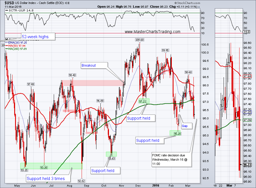
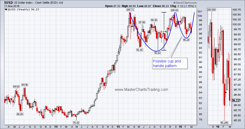
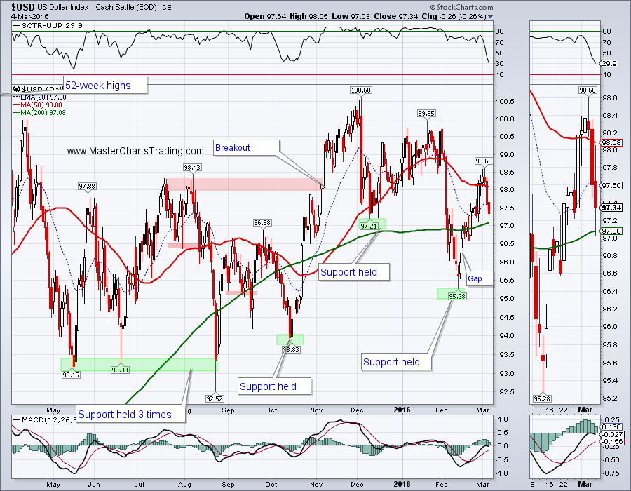
The US Dollar index certainly did not like Mario Draghni’s announcement of more easing and more negative interest rates. Sometimes markets react in a completely unpredictable ways. To me more European easing should have translated into a stronger dollar, but traders thought the opposite, at least in the short term.
CHART OF $USD
Long-term $USD is clearly in a bull market and is trading not very far from the 52-week highs. Next Wednesday FOMC is due to release its interest rate decision, which is certain to send more shockwaves through the currency markets. Should FOMC surprise the markets with an interest rate hike, the Dollar could easily bounce.
LONG-TERM CHART OF $USD
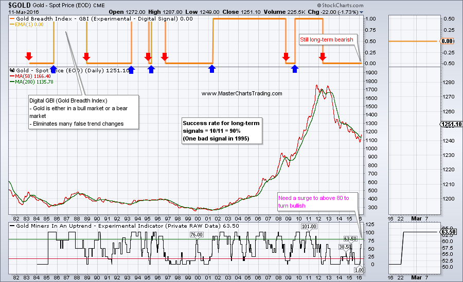
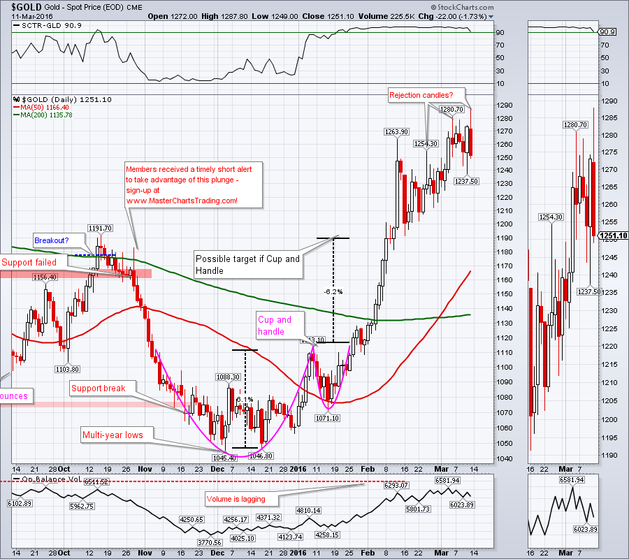
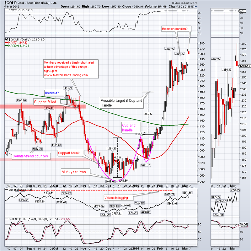
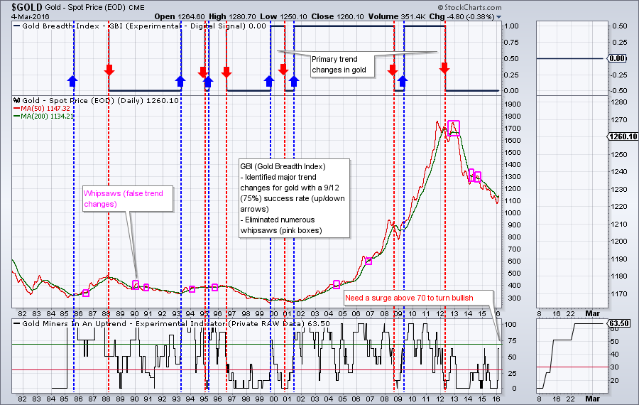
Moving on to gold, which has attracted huge amounts of attention with its possible bullish breakout. I still say “possible” because similarly to my stock market model (MBI), I developed a gold market trend model. As of the writing of this newsletter GBI (Gold Breadth Index – proprietary) has not yet flipped into the bullish camp.
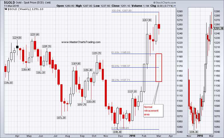
Even if gold did become bullish in the long-term, a retracement to the Fibonacci levels as pictured in the chart below is very likely.
1-YEAR WEEKLY CHART OF GOLD
Friday’s action in gold looks particularly bad, it shows both a possible rejection of higher prices and significant selling pressure. Friday’s candlestick had a large wick out the top (rejection) and it is also a large red candlestick (selling pressure). We will see if next week brings more selling, especially around the FOMC time.
GOLD CHART
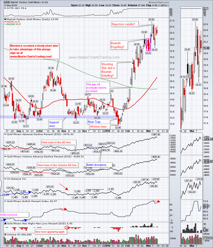
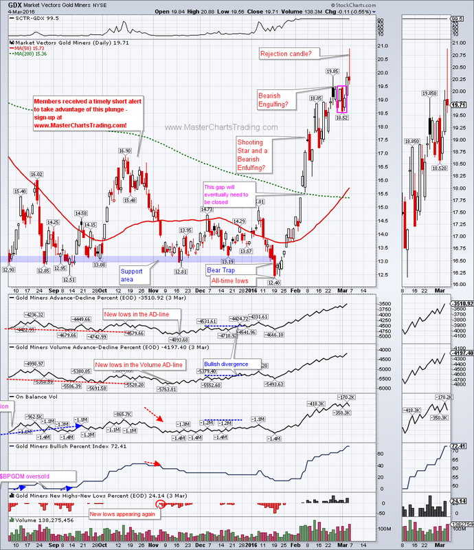
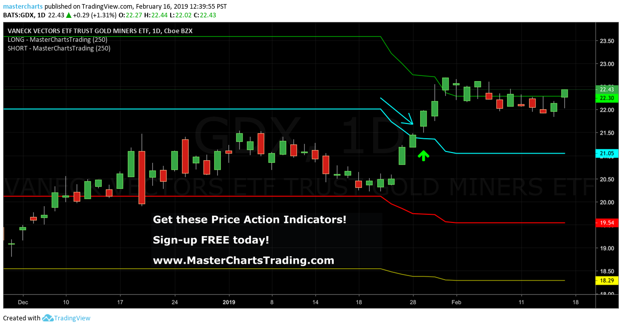
GDX chart shows similar patterns as gold. It is also possible that Bullish Percent index for GDX has topped out and started dropping. This is a welcome sign for gold bears.
CHART OF GDX
CHART OF GDX
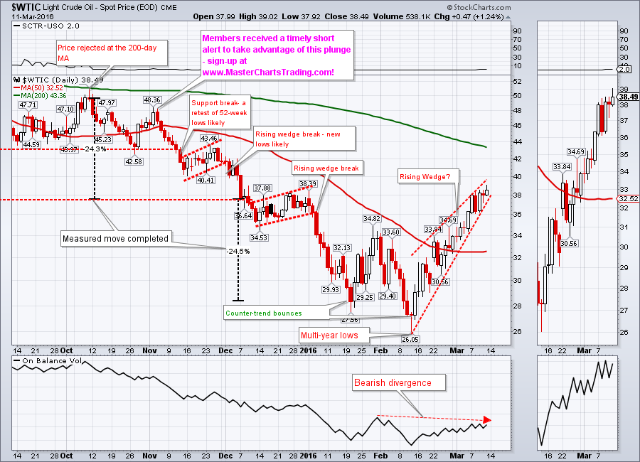
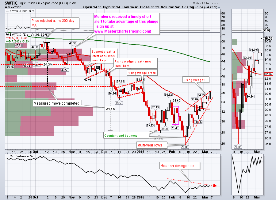
Oil has been rising in a wedge-like pattern off the multi-year lows set in February. There is lots of overhead resistance from multiple broken support levels and previous chart structures. Oil is still bearish, so a wedge break with a close below around $37 could signal a continuation of the major down trend.
CHART OF $WTIC
CHART OF $WTIC
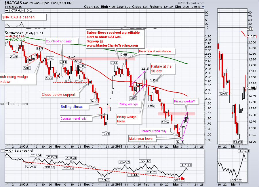
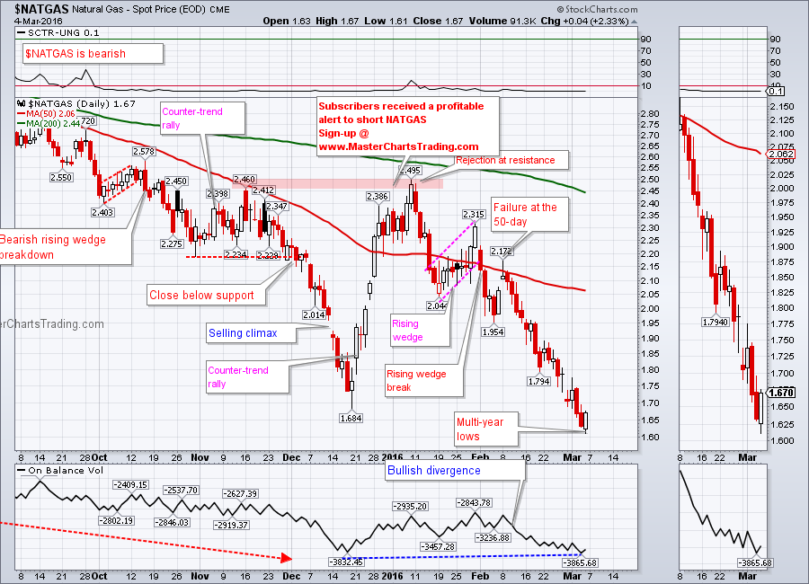
Natural gas also bounced from the multi-year lows set just last week, with a similar possible rising wedge pattern. Friday’s action looks like a rejection candle around a previous congestion/support area. Its possible for NATGAS to push higher, perhaps to the 50-day moving average, but it could also simply fail here and continue to fresh multi-year lows.
CHART OF NATGAS
CHART OF NATGAS
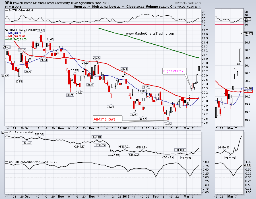
Finally agricultural commodities may be showing some signs of life. DBA (Diversified Agricultural Commodities Fund) rebounded strongly off the multi-year lows set in February and is now trading close to the 200-day moving average. Similar bounces in the past failed miserably, will this time be different?
CHART OF DBA
CHART OF DBA
Trade Alerts Service is now live – please sign-up here!
That’s it for this week’s market recap,
Best Regards and have another great trading week!
Alexander Berger (www.MasterChartsTrading.com)
That’s it for this week’s market recap,
Best Regards and have another great trading week!
Alexander Berger (www.MasterChartsTrading.com)


 RSS Feed