|
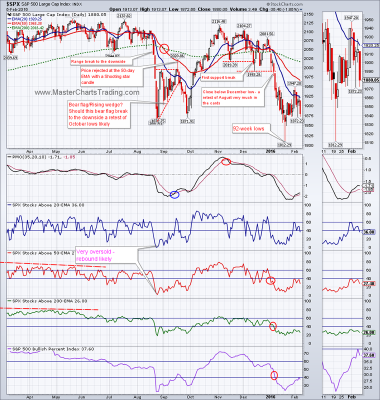
The bulls better make a stand soon! $SPX is rapidly approaching the August 2015 lows in the 1860s range. A close below that area would most likely cause a further drop of about 10% or so. For now bulls have been largely unable to produce any meaningful rebound and the support break from the beginning of the year is still holding.
CHART OF $SPX |
|
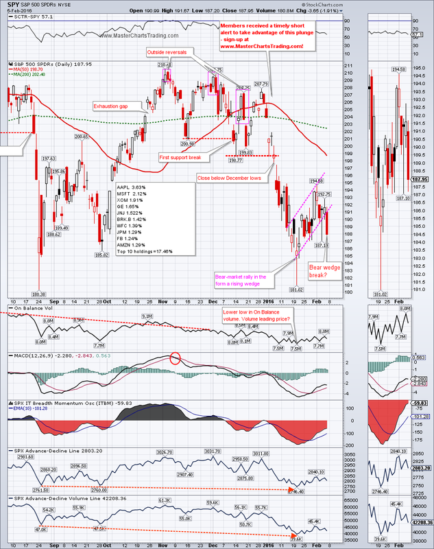
I marked the chart of SPY with a possible Rising Wedge formation and a possible wedge break on Friday. I say “possible” because it is very difficult to draw a rising wedge due to the spike low from January 20th. Rising wedges in a bearish security are continuation patterns, so a wedge break to the downside signals more downside to come.
CHART OF SPY
CHART OF SPY
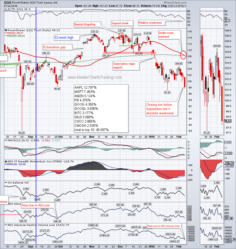
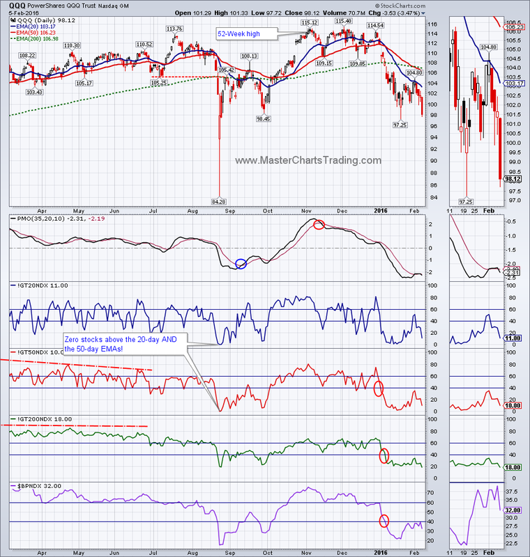
Of note this week is the relative weakness in the higher-beta NASDAQ 100 ETF – QQQ. Several negative issues with this chart include:
1.Imminent Death (bear) cross of the 50-day moving average crossing below the 200-day moving average
2.Friday’s close took the ETF below its September 2015 lows
3.Relative weakness compared to the universe of other ETFs
4.A new low in the Advance-Decline Volume line
Weakness in technology is very negative for the general market because the technology sector accounts of over 20% of the stocks within the S&P 500.
CHART OF QQQ
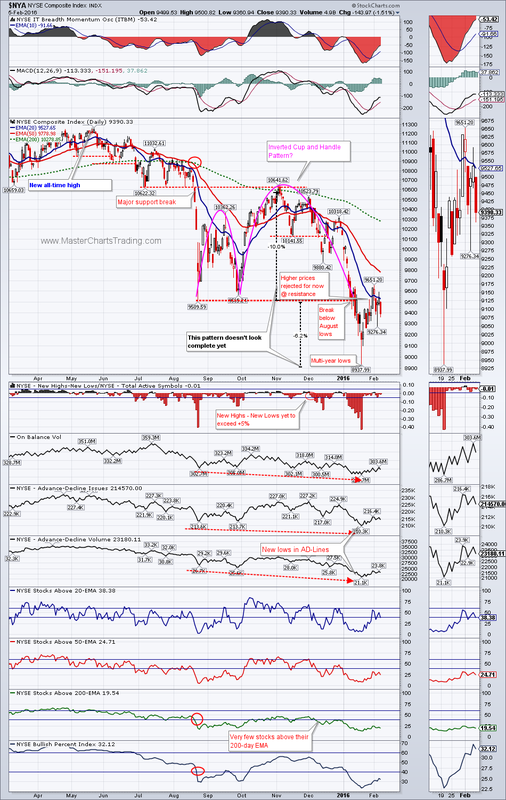
The broader NYSE Composite index is showing a similar patter to the $SPX. I pointed out an inverse Cup and Handle pattern on the chart of $NYA a few weeks ago. $NYA hit multi-year lows in mid-January, but as I said, this inverse Cup and Handle pattern doesn’t feel complete yet, since it only dropped 6% following the breakdown. If $NYA turns around and continues lower, we can easily see at least 10% drop from Friday’s prices before any meaningful bounce occurs.
CHART OF $NYA
CHART OF $NYA
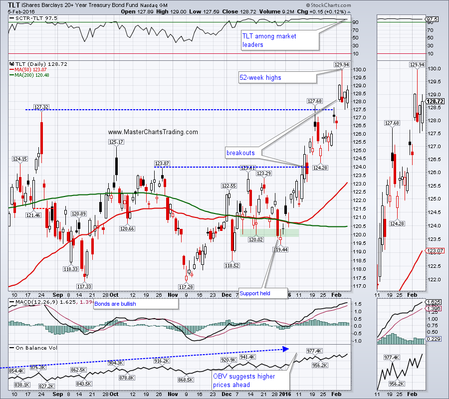
Bonds are benefiting from all the stock market turmoil and are continuing as the market leaders. TLT (Long Treasury bonds) broke out in January. Then again, TLT gapped up just this Tuesday to hit a 52-week high on Wednesday. For now the gap-up is holding. Treasuries are the ultimate safe-haven assets, and strength in the government bonds coupled with a weakness in the stock markets is reinforcing my risk-off posture.
CHART OF TLT
CHART OF TLT
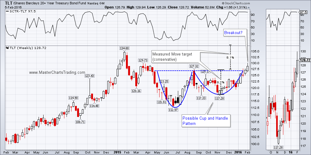
The long-term picture for TLT looks even better right now. TLT closed above the possible Cup and Handle pattern on the weekly chart. Should this Cup and Handle play out, we could easily see a challenge of the all-time highs set in the early 2015. The depth of the pattern is indicating that TLT could go well above those highs.
LONG-TERM TLT CHART
LONG-TERM TLT CHART
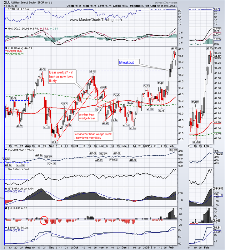
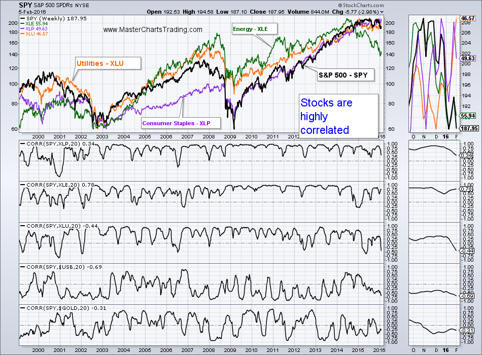
Utilities also broke out above the October resistance and are approaching all-time highs. Undoubtedly this is due to the overall risk-off environment as investors are rotating out of the high-beta stocks into the low-beta utilities.
CHART OF UTILITIES
Please keep in mind the utilities are still stocks and thus correlate highly to the general market. If a true pandemonium starts and investors try to unwind their long positions, utilities will also get sold. Notice on the chart below that various stock funds move more or less together and correlate highly to the general market. I purposefully picked the most uncorrelated ETFs to the general market to prove a point (XLF, XLI, XLK, XLY correlate even higher). Even Utilities, Consumer Staples and Energy will get sold during the market routs – there is no place to hide in stocks.
ASSET CORRELATION TO SPY
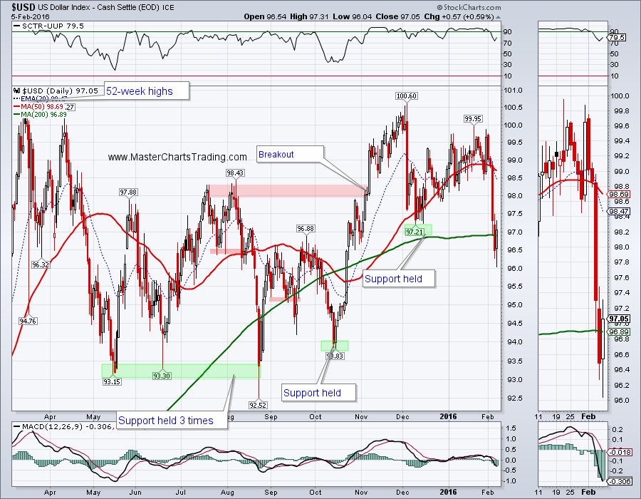
The Dollar index got slammed this week, as Euro and the Yen was able to make substantial gains against the dollar. For now I still think that the dollar index is bullish and dollar bulls will step in very soon. Dollar weakness was especially helpful for gold.
CHART OF $USD
CHART OF $USD
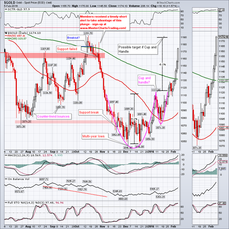
I pointed out a possible Cup and Handle pattern on gold chart a few weeks ago and this pattern seems to be playing out. My subscribers were warned against shorting gold/GDX this week, as I didn’t feel like this pattern has played out just yet. Without a doubt, gold is overbought, but could push higher to the $1190 area to complete this pattern. There is a lot of resistance in the $1190 area from the October peak, so that would be a logical place for the bears to step in.
GOLD CHART
GOLD CHART
Even after this week’s gains I think that long-term gold is still in a bear market and it would take a lot more to reverse it.
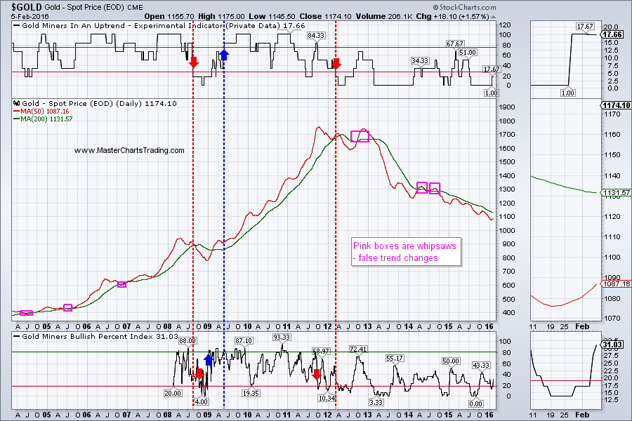
There are various ways of identifying the long-term trend of a security. One of the most common ways is to look at the 50-day simple moving average and the 200-day moving average. If the 50-day is above the 200-day, then the security is bullish and vice versa. This technique works OK most of the time, but it does occasionally produce whipsaws (false trend changes).
I presented my experimental Gold Miners in an Uptrend Indicator (GDXIND) last week. This indicator looks at a basket of gold miners and their trend indicators and attempts to quantify the signals. If a bullish signal is triggered, a bullish bias is maintained until a reversing bearish signal supersedes its. GDXIND gave a bearish signal in early 2012 and is yet to reverse direction.
Similarly data exists for the Gold Miners Bullish Percent Index ($BPGDM) going back to 2008. In the life of a market this is not a terribly long time period, but nevertheless $BPGDM does produce useful signals. $BPGDM gave a bearish signal back 2011 and it too is yet to reverse.
GDX itself just broke above the 200-day moving average and was able to close above the October highs – certainly a positive sign. The Advance-Decline lines and the On-Balance volume indicators are also showing a good participation. As with gold, I can unequivocally say that GDX is now overbought. GDX is ripe for either profit taking, or an outright bear attack, especially if the dollar rallies from here.
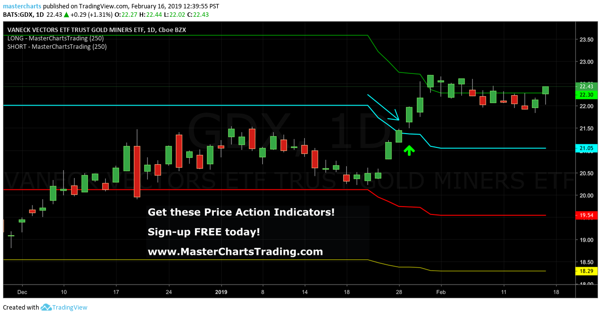
CHART OF GDX
There are various ways of identifying the long-term trend of a security. One of the most common ways is to look at the 50-day simple moving average and the 200-day moving average. If the 50-day is above the 200-day, then the security is bullish and vice versa. This technique works OK most of the time, but it does occasionally produce whipsaws (false trend changes).
I presented my experimental Gold Miners in an Uptrend Indicator (GDXIND) last week. This indicator looks at a basket of gold miners and their trend indicators and attempts to quantify the signals. If a bullish signal is triggered, a bullish bias is maintained until a reversing bearish signal supersedes its. GDXIND gave a bearish signal in early 2012 and is yet to reverse direction.
Similarly data exists for the Gold Miners Bullish Percent Index ($BPGDM) going back to 2008. In the life of a market this is not a terribly long time period, but nevertheless $BPGDM does produce useful signals. $BPGDM gave a bearish signal back 2011 and it too is yet to reverse.
GDX itself just broke above the 200-day moving average and was able to close above the October highs – certainly a positive sign. The Advance-Decline lines and the On-Balance volume indicators are also showing a good participation. As with gold, I can unequivocally say that GDX is now overbought. GDX is ripe for either profit taking, or an outright bear attack, especially if the dollar rallies from here.
CHART OF GDX
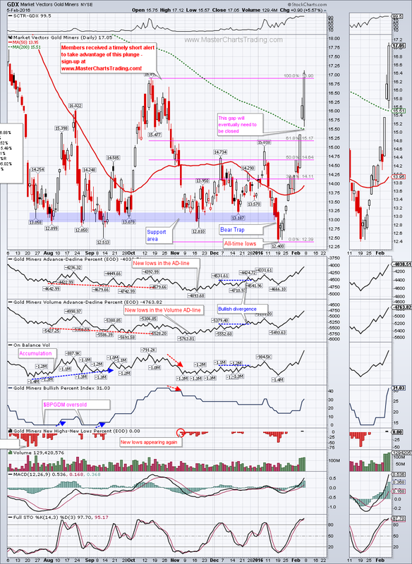
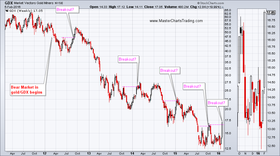
Looking at the weekly long-term chart of GDX I can see at least 4 similar looking “breakouts” that ultimately resulted in a reversal and fresh 52-week lows.
Bottom line: We need to see a significant improvement in GDX market breadth, and a trend change in gold before a bottom in gold prices could even be contemplated.
LONG-TERM GDX CHART
Bottom line: We need to see a significant improvement in GDX market breadth, and a trend change in gold before a bottom in gold prices could even be contemplated.
LONG-TERM GDX CHART
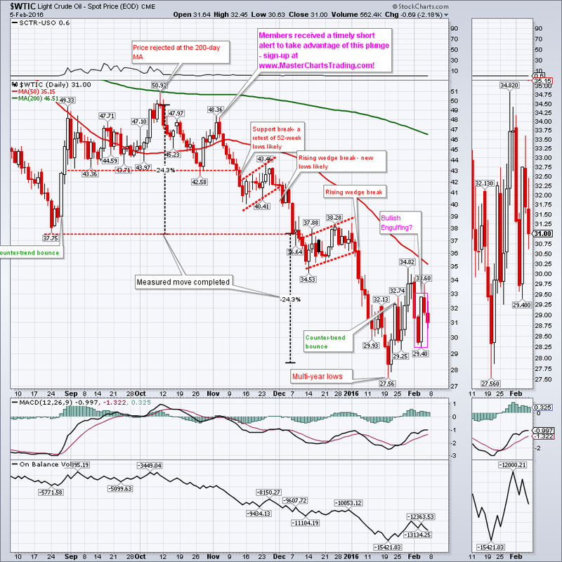
Oil had what looked like a Bullish Engulfing pattern on Tuesday/Wednesday, but failed to confirm the pattern with higher prices so far. Long-term oil is bearish, and sold-off on Thursday and Friday despite a weaker dollar.
CHART OF $WTIC
CHART OF $WTIC
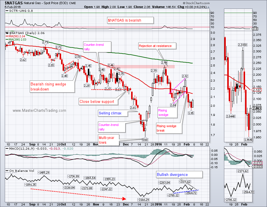
Natural gas had a possible Rising Wedge break to the downside this week and pushed lower. However Friday’s action leaves much to be desired for the NATGAS bears (like me). There now seems to be a slight bullish divergence between the price itself and the On-Balance volume indicator. Maybe NATGAS will attempt a throwback to the 50-day moving average, around 2.14 before resuming its downward march?
CHART OF NATGAS
CHART OF NATGAS
Trade Alerts Service is now live – please sign-up here!
That’s it for this week’s market recap,
Best Regards and have another great trading week!
Alexander Berger (www.MasterChartsTrading.com)
Trade Alerts Service is now live – please sign-up here!
That’s it for this week’s market recap,
Best Regards and have another great trading week!
Alexander Berger (www.MasterChartsTrading.com)


 RSS Feed