|
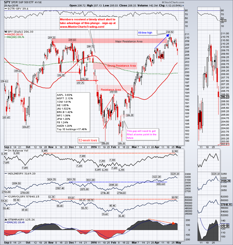
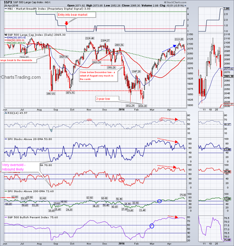
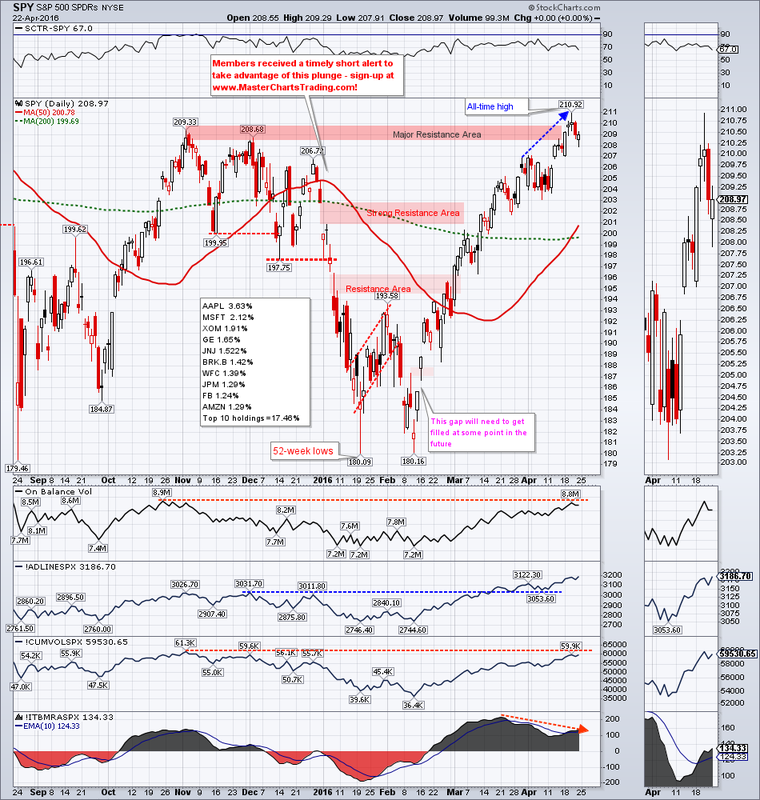
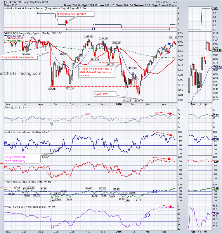
Last week I mentioned that there were numerous divergences present on the charts of major stock indices. It now seems that these bearish divergences are working out. For the week $SPX lost a little over 1% to close at 2065.30. Stocks are somewhat oversold on the short-term basis, so a snap-back rally would not surprise me at this point.
CHART OF SPY CHART OF $SPX |
|
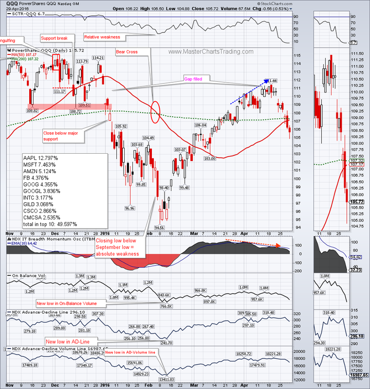
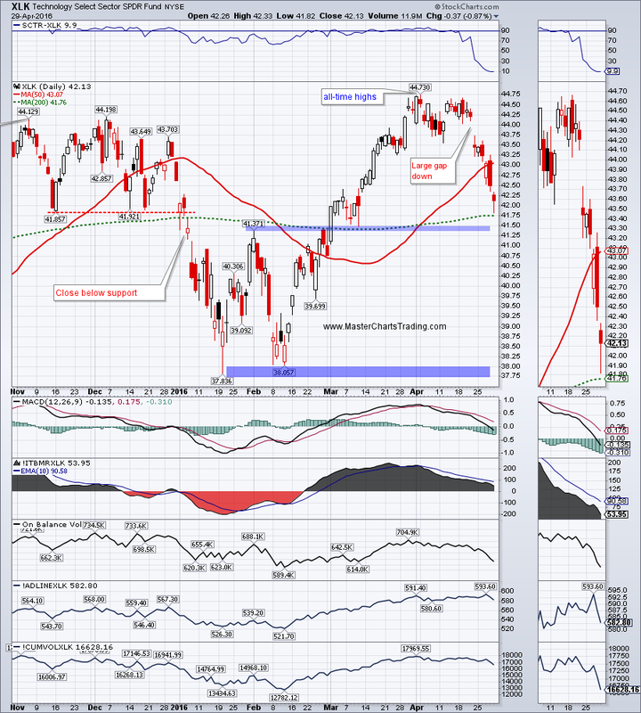
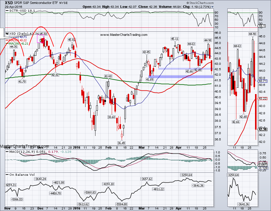
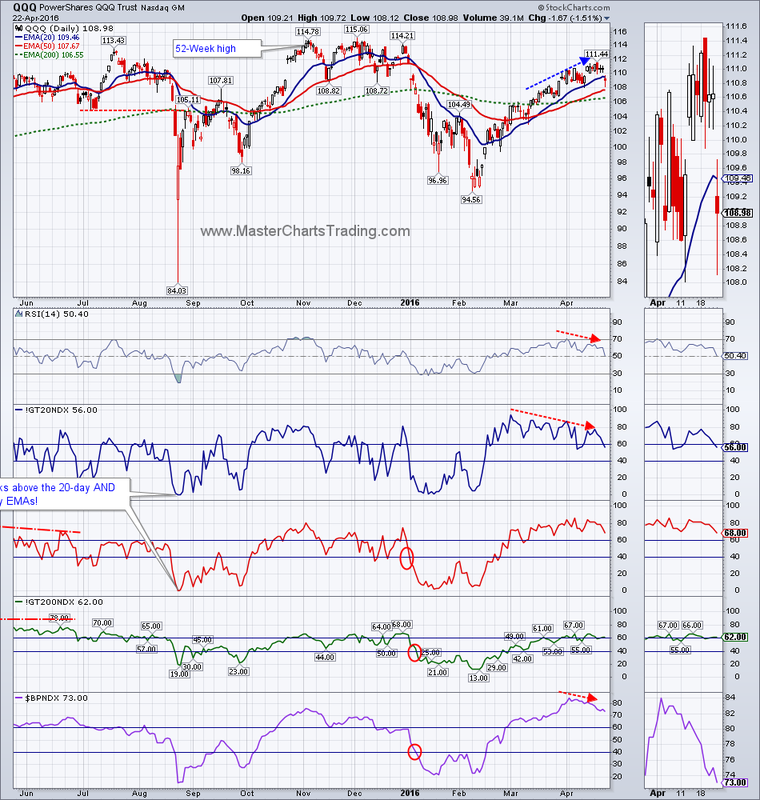
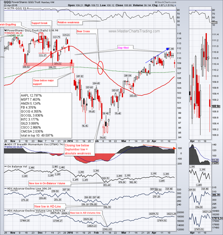
Technology stocks were under strong pressure with XLK down over 3%, and the broad semiconductors XSD finishing down almost 4% for the week. This is showing selling in some of the most economically sensitive groups of the market.
CHART OF QQQ
CHART OF XLK
CHART OF XSD (semiconductors)
CHART OF QQQ
CHART OF XLK
CHART OF XSD (semiconductors)
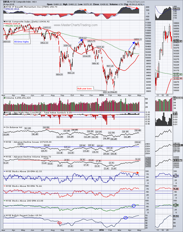
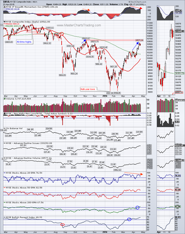
The broad New York Stock Exchange composite came extremely close to closing below the recent support at 10,425. I don’t think the correction is over and we could still see significant downside for $NYA.
CHART OF $NYA
CHART OF $NYA
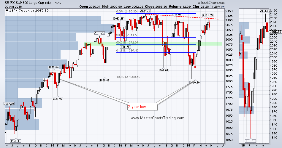
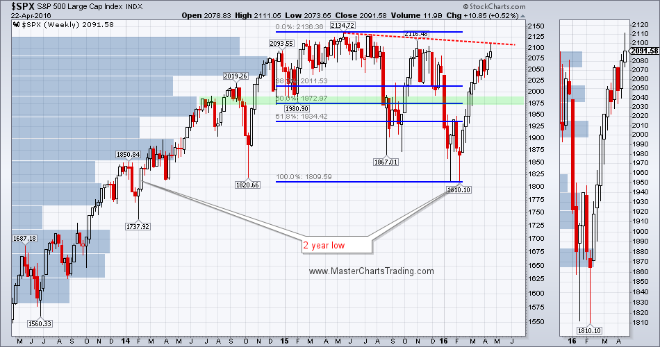
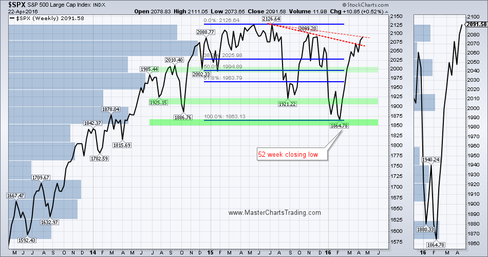
On the weekly chart of $SPX, we can draw a trend line touching the tops in June and October 2015, and the recent top from last week. These 3 peaks form a nice-looking downward sloping trend line. It remains to be seen if this trend line will now act as resistance. For now it did.
CHART OF $SPX with Fibonacci retracements
CHART OF $SPX with Fibonacci retracements
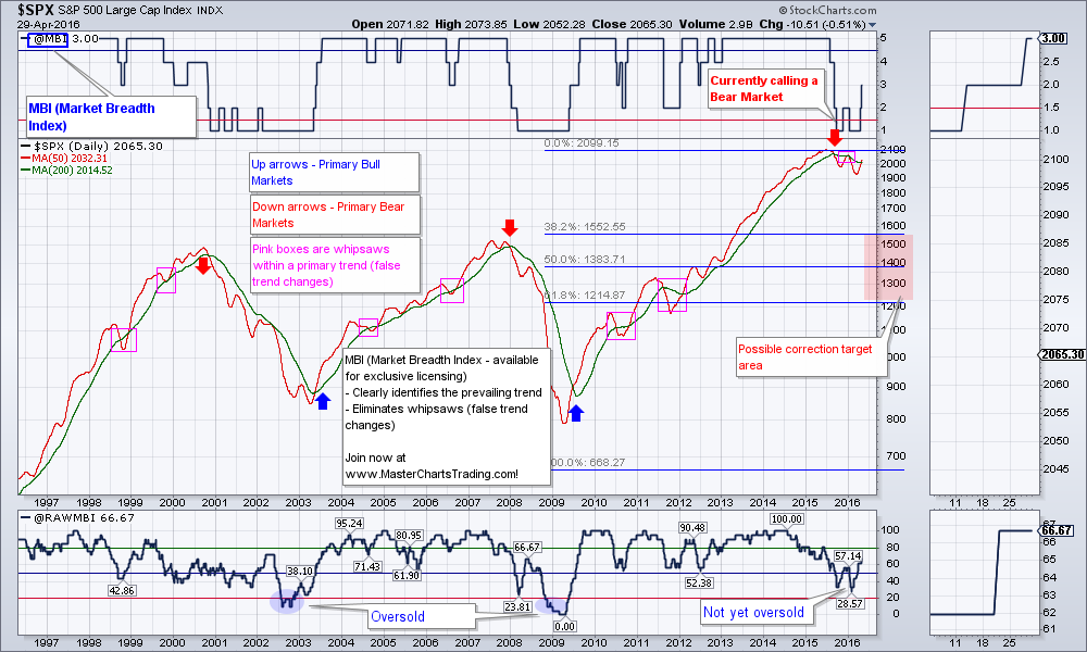
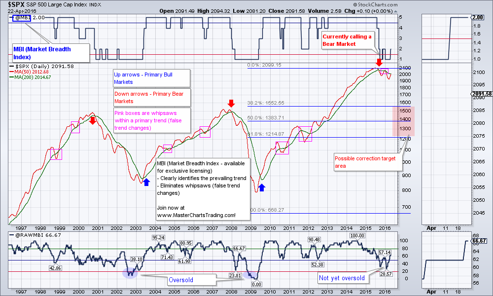
Market breadth has indeed improved. The only major concern remains the lack of volume on this move higher. My long-term stock market model (MBI) has flipped into the bear mode as early as September of last year but has now begun to improve. Nevertheless, I am still treating stocks as a bearish security until a bullish signal is given, and am only looking to short.
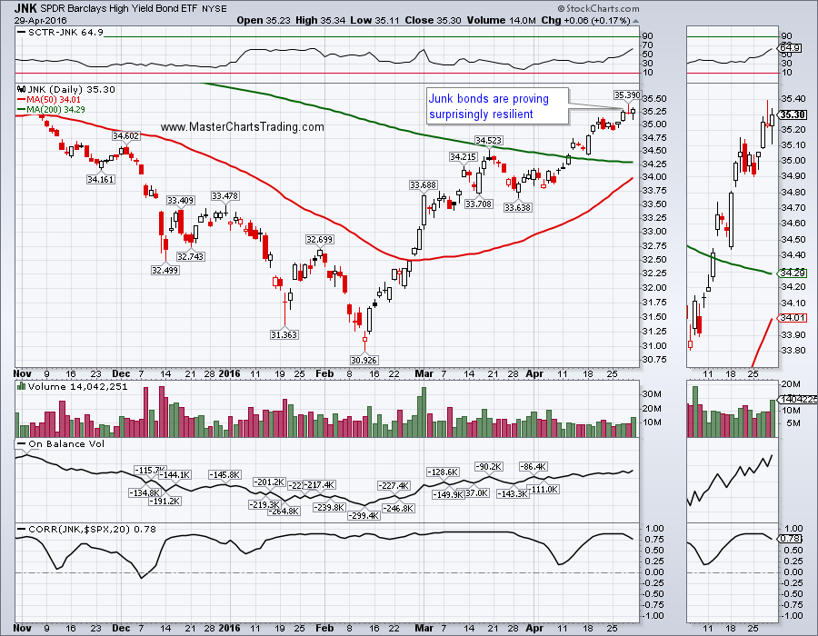
Junk bonds (high-yield corporate) are acting surprisingly resilient. Junk bonds have very high correlation to stocks, so I am watching JNK very closely for the signs of further improvement, to see if the bullish case for stocks improves.
CHART OF JNK
CHART OF JNK
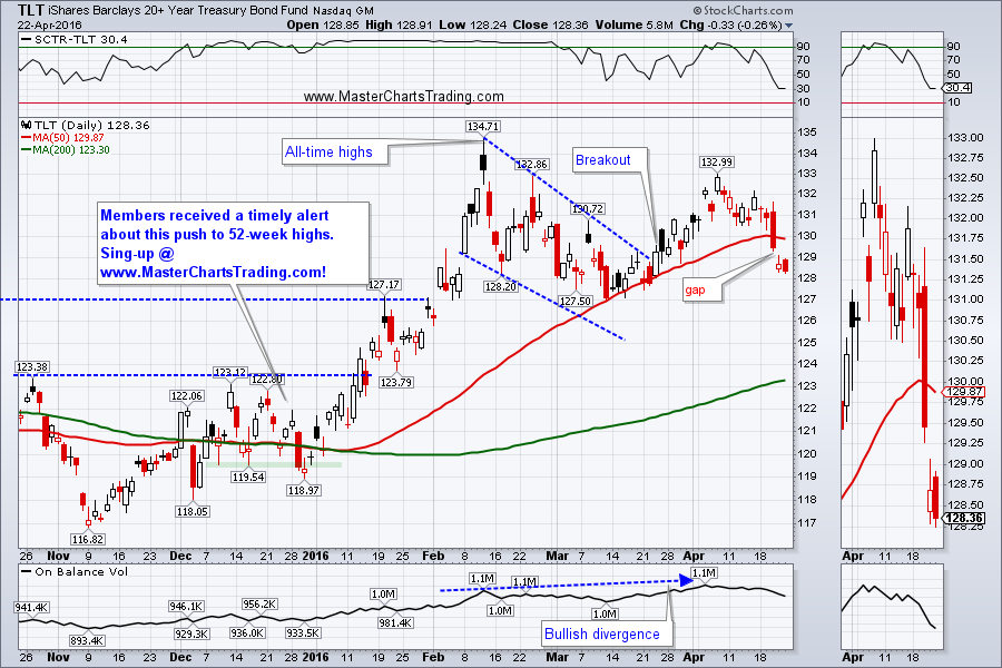
US Long Treasuries seem to have found support at the previous breakout level and bounced higher. TLT is up for the week. This makes sense, as investors are rotating out of stocks and into bonds.
Long-term chart of TLT still shows a giant Cup and Handle pattern. A breakout above the pattern high at $134 would be extremely bullish for bonds and bearish for stocks.
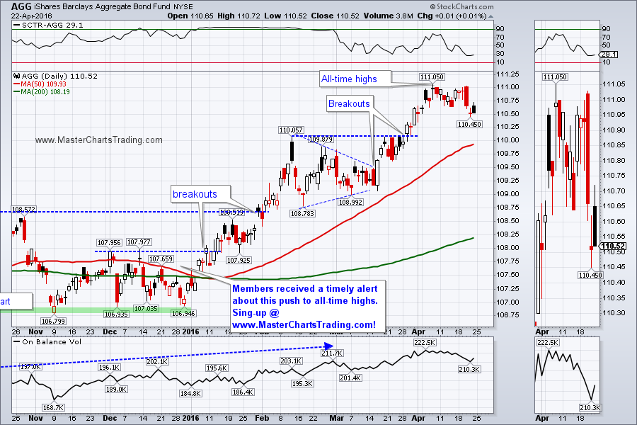
The more diversified bond fund AGG is consolidating near the all-time highs and looks poised to re-challenge them again. Should stocks come under more selling, AGG is likely to benefit.
CHART OF TLT
LONG-TERM TLT CHART
CHART OF AGG.
LONG-TERM CHART OF AGG
Long-term chart of TLT still shows a giant Cup and Handle pattern. A breakout above the pattern high at $134 would be extremely bullish for bonds and bearish for stocks.
The more diversified bond fund AGG is consolidating near the all-time highs and looks poised to re-challenge them again. Should stocks come under more selling, AGG is likely to benefit.
CHART OF TLT
LONG-TERM TLT CHART
CHART OF AGG.
LONG-TERM CHART OF AGG
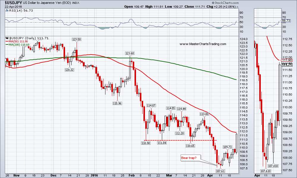
We got more fireworks in the currencies arena this week. This is because Bank of Japan failed to deliver more quantitative easing then the market was anticipating. The Yen gained strongly as USDJPY Forex pair lost almost 5%.
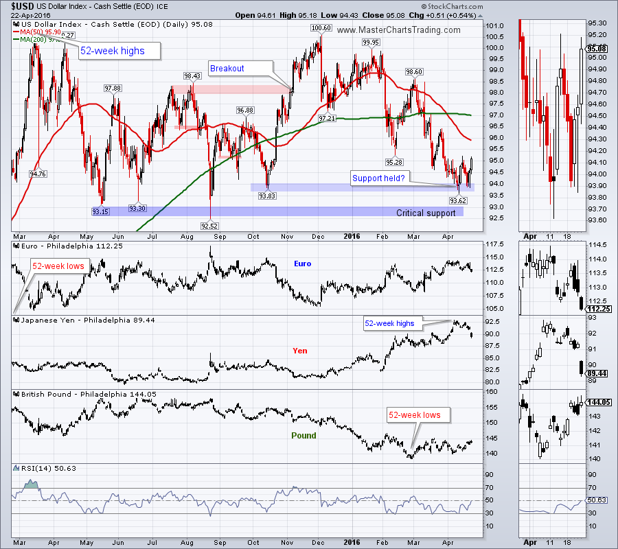
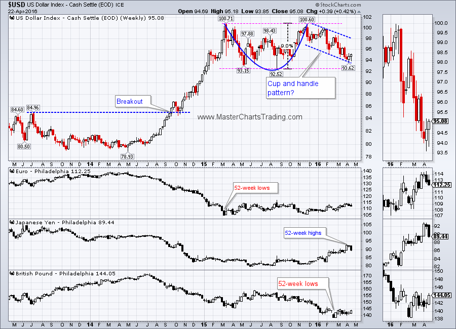
The US Dollar index came under serious pressure against major currencies and ended the week over 2% lower. USD is now at a critical support marked on the chart below. A break of that level could spell an even more significant downside correction for USD.
USDJPY FOREX PAIR
CHART OF $USD
LONG-TERM CHART OF $USD
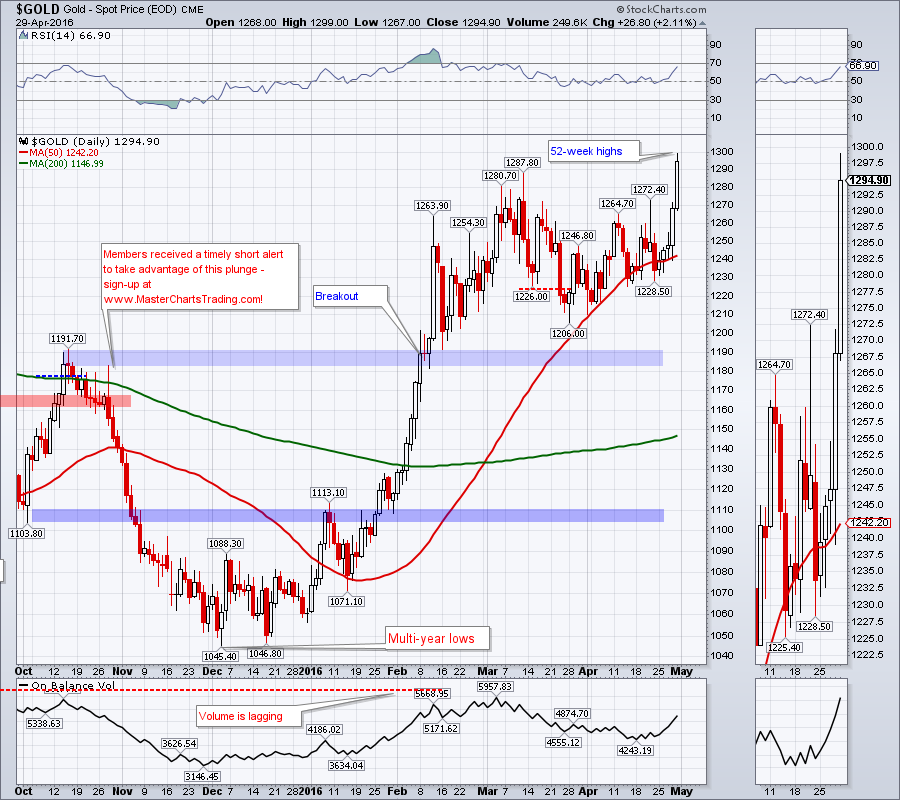
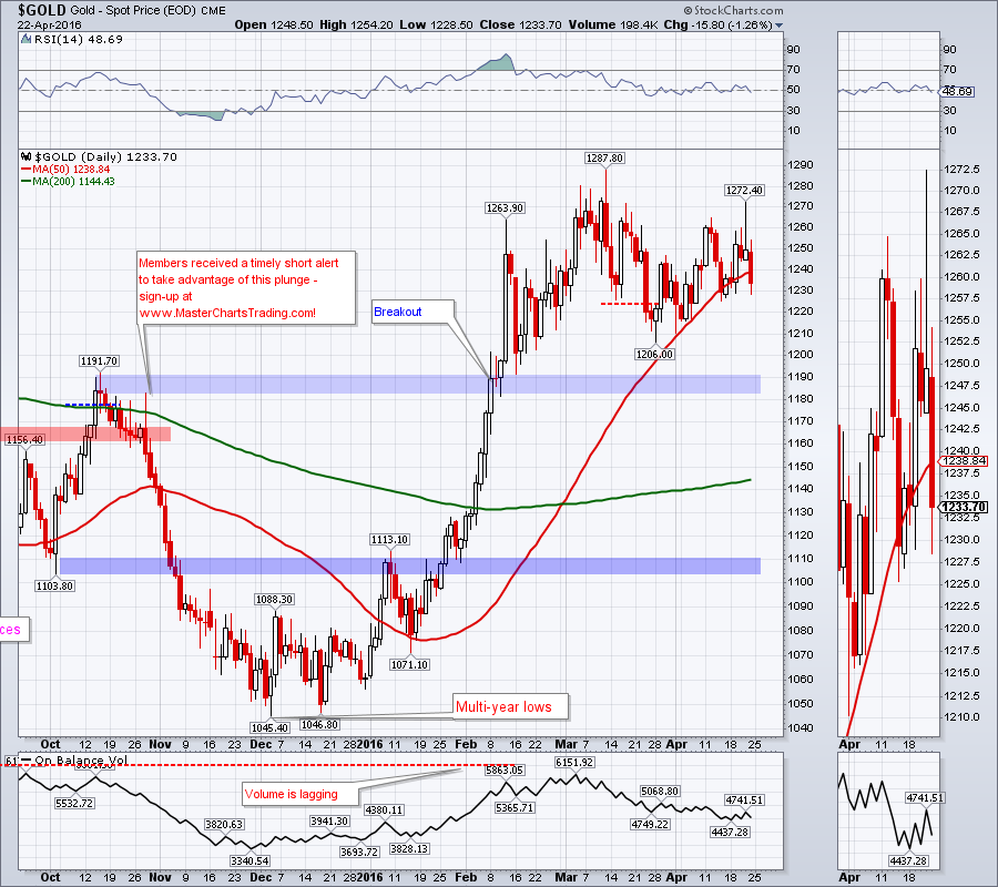
Precious metals are taking advantage of the cheaper US dollar. Gold reversed from the 50-day moving average and made another 52-week high.
Few weeks ago I mentioned that my long-term gold model (GBI) has flipped into a bull mode and I am now looking to buy gold and to trade it on the upside. However gold needs to correct quite a bit more for me to become interested opening a long.
GOLD CHART
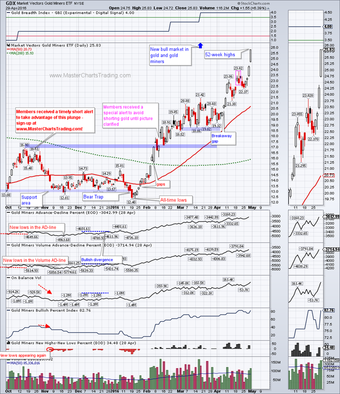
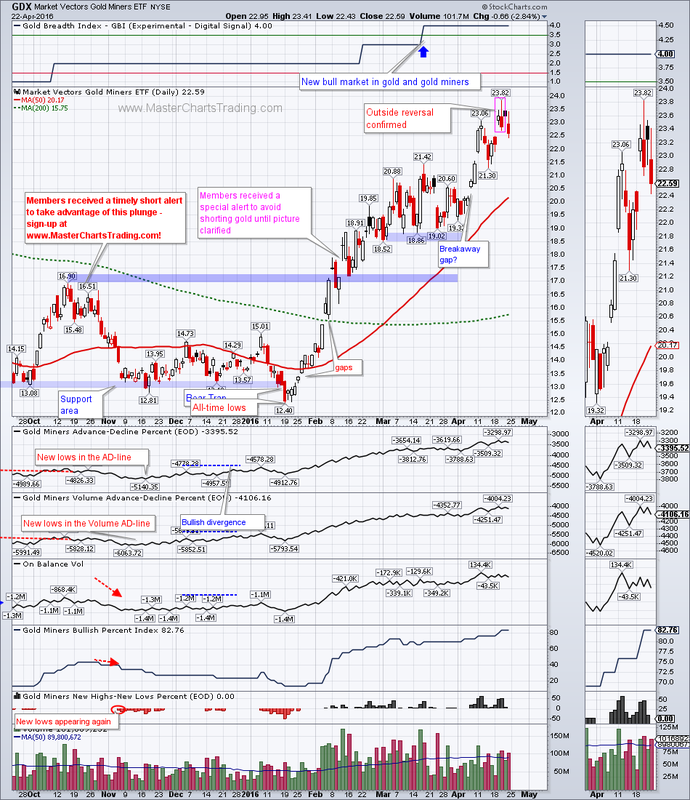
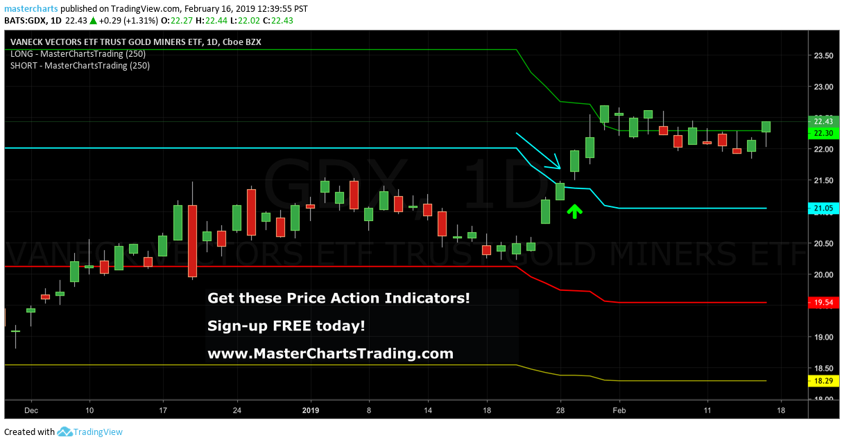
Same comments apply to the gold miners ETF. GDX is enjoying the benefits of a weaker dollar as it moved over 100% off the all-time lows set in January. It is certainly overbought by pretty much any definition of this word, but at the same time it is showing strength. I consider GDX to now be a bullish security and also am looking to buy on a pullback.
CHART OF GDX
Few weeks ago I mentioned that my long-term gold model (GBI) has flipped into a bull mode and I am now looking to buy gold and to trade it on the upside. However gold needs to correct quite a bit more for me to become interested opening a long.
GOLD CHART
Same comments apply to the gold miners ETF. GDX is enjoying the benefits of a weaker dollar as it moved over 100% off the all-time lows set in January. It is certainly overbought by pretty much any definition of this word, but at the same time it is showing strength. I consider GDX to now be a bullish security and also am looking to buy on a pullback.
CHART OF GDX
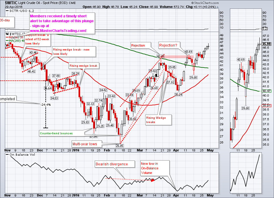
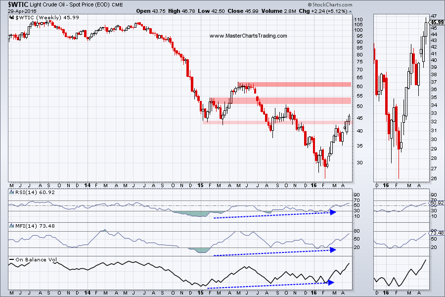
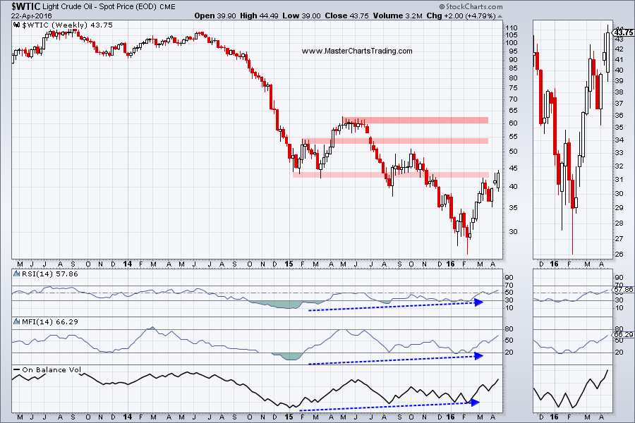
Oil was able to power through the resistance level at around $43. Perhaps prices have stabilized for now, or perhaps this is just another strong short-covering rally. There is potent resistance further up around $53.
Picture in oil is somewhat ambiguous, so I would wait for a resolution either to the upside or the downside before attempting to trade it.
LONG-TERM CHART OF $WTIC
CHART OF $WTIC
Picture in oil is somewhat ambiguous, so I would wait for a resolution either to the upside or the downside before attempting to trade it.
LONG-TERM CHART OF $WTIC
CHART OF $WTIC
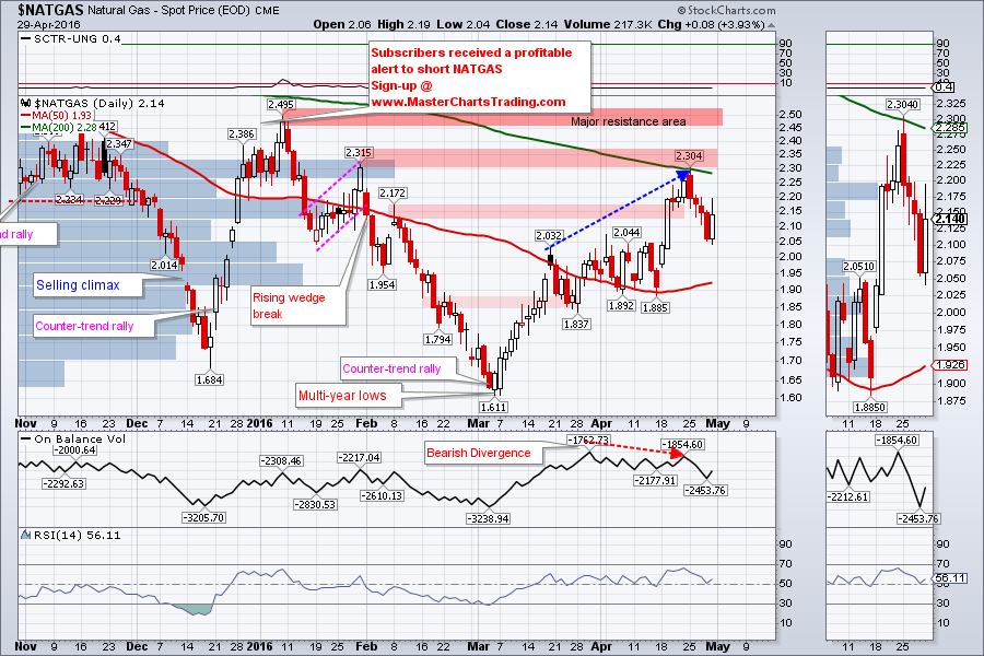
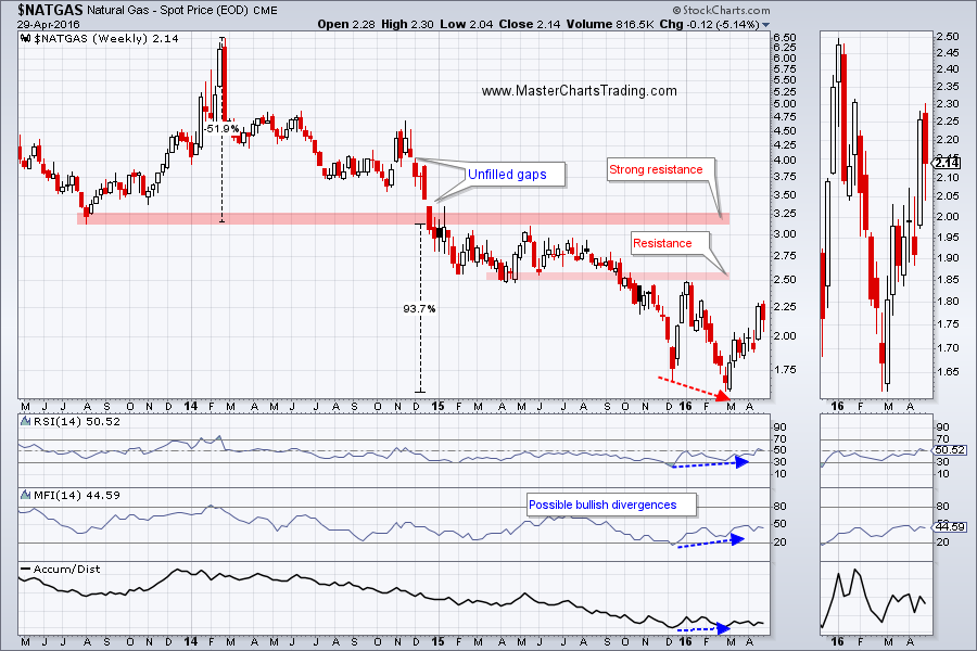
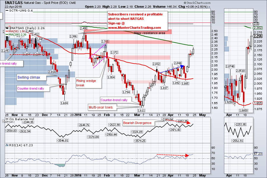
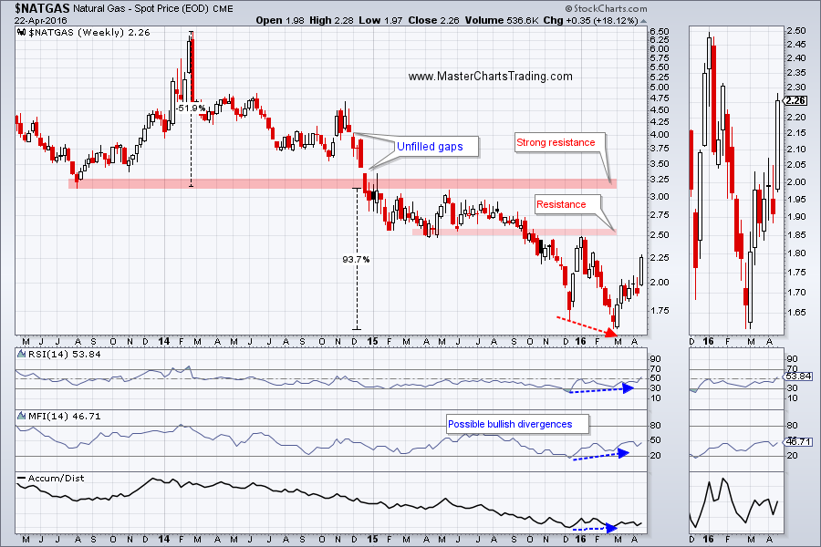
NATGAS is advancing in a very choppy manner. This week NATGAS touched the 200-day moving average at 2.304 and pulled back. But the pullback seems to have stopped on Friday. Unless we collapse from here, I can make a case for NATGAS to advance to the all-important 2.50 area of the chart. That area is showing major resistance especially on the weekly long-term chart. If NATGAS manages to close above 2.50, I think a new bull market in NATGAS would have started by then.
CHART OF NATGAS
LONG-TERM CHART OF NATGAS
CHART OF NATGAS
LONG-TERM CHART OF NATGAS
Trade Alerts Service is now live – sign-up here today!
That’s it for this week’s market recap,
Best Regards and have another great trading week!
Alexander Berger (www.MasterChartsTrading.com)
That’s it for this week’s market recap,
Best Regards and have another great trading week!
Alexander Berger (www.MasterChartsTrading.com)


 RSS Feed