|
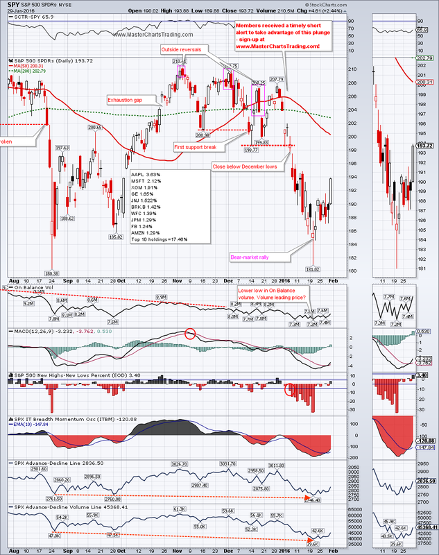
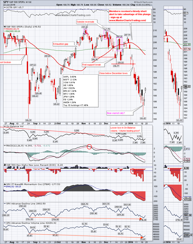
Quantitative easing (money printing), extremely low or even negative interest rates around the world are helping stock indices recover from the somewhat oversold levels. SPY gained a little over 1.6% for the week to end the week at $193.72. This oversold bounce was expected and it sure came as a relief for many investors. The question on everyone’s minds is of course whether or not this is a sustainable rally, or simply a short-covering one.
CHART OF SPY |
|

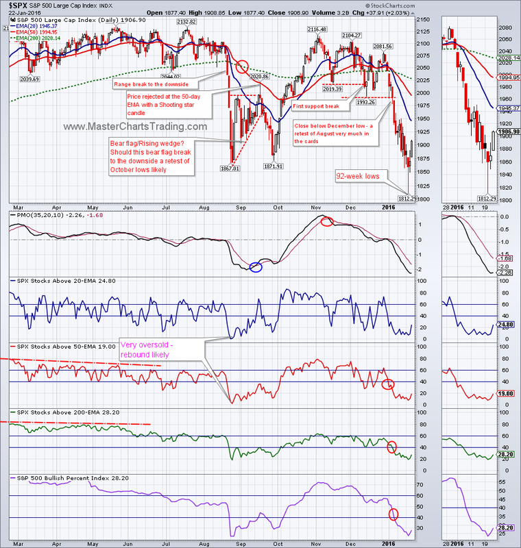
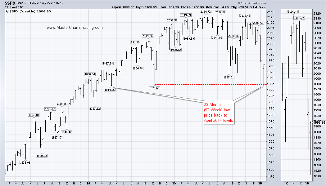
My opinion has not yet changed and I think we are still in the middle of a bear market. How long this bear market will continue is anyone’s guess. It could end next month if $SPX makes an all time high and breadth turns bullish, or it could end in 5 years – nobody really knows. For now I am already seeing first stages of an overbought condition develop. The percent of stocks above the 20-day exponential moving average for $SPX is already approaching 60%, which is overbought for a bear market. Next logical resistance level for $SPX is around the broken support at 1993 – a great place for it to fail.
CHART OF $SPX
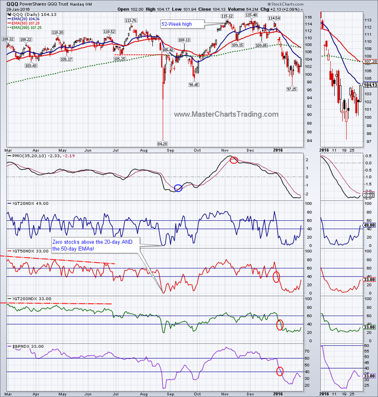
CHART OF QQQ (video bonus)
CHART OF $SPX
CHART OF QQQ (video bonus)
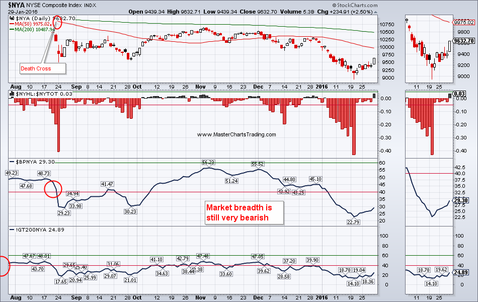
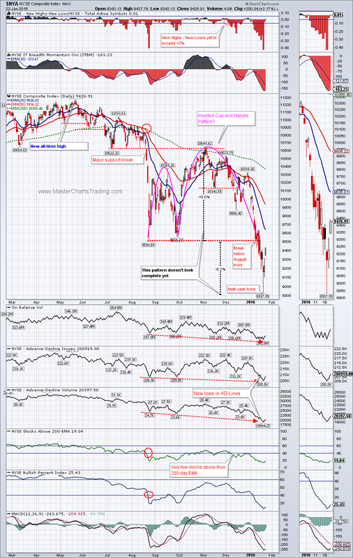
What will it take for me to turn bullish? Lets look at the chart of New York Stock Exchange Composite ($NYA) that I showed in the past. Four indicators are present on this chart:
1.The 50 and the 200-day simple moving averages
2.New Highs less New Lows Percentage
3.Bullish percent index
4.Percent of stocks above the 200-day exponential moving average
What I am seeing is that market breadth for $NYA is still very much bearish. Currently all 4 of the above indicators are in the bear mode. If/when at least some turn bullish, we will re-assess and see if a new bull market is upon us.
CHART OF $NYA
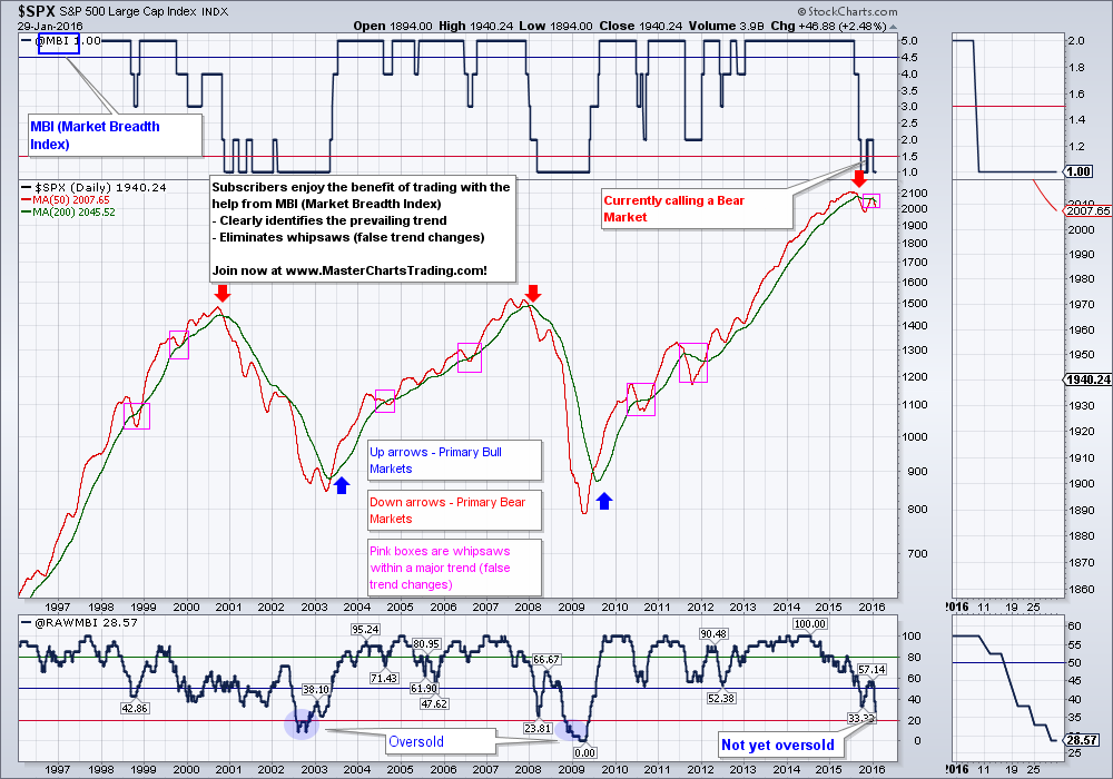
Finally my custom Market Breadth Index (MBI) is firmly in a bear-market territory. The only positive thing I can say about the current market stance is that one of the raw inputs for MBI (RAWMBI) is somewhat oversold. It is certainly not oversold enough to call for any kind of bottom. In the past RAWMBI had to get to teens or even single digits before the bear-market bottom was put in.
I use MBI in generating tradable signals for my subscribers – check out the backtesting results here: http://www.masterchartstrading.com/performance.html
I use MBI in generating tradable signals for my subscribers – check out the backtesting results here: http://www.masterchartstrading.com/performance.html
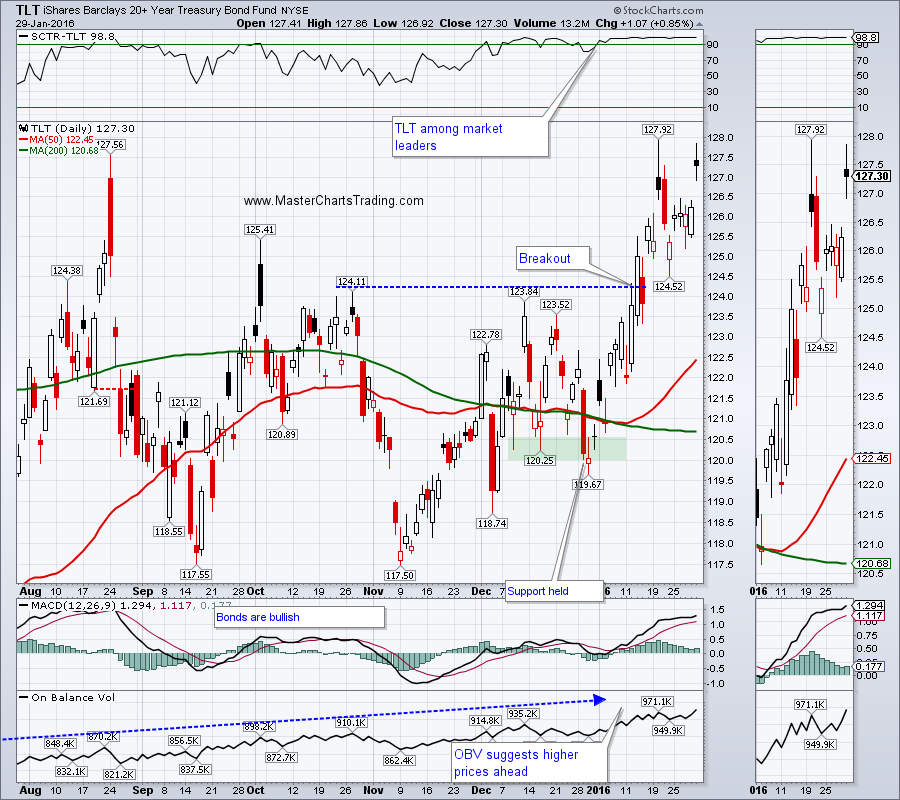
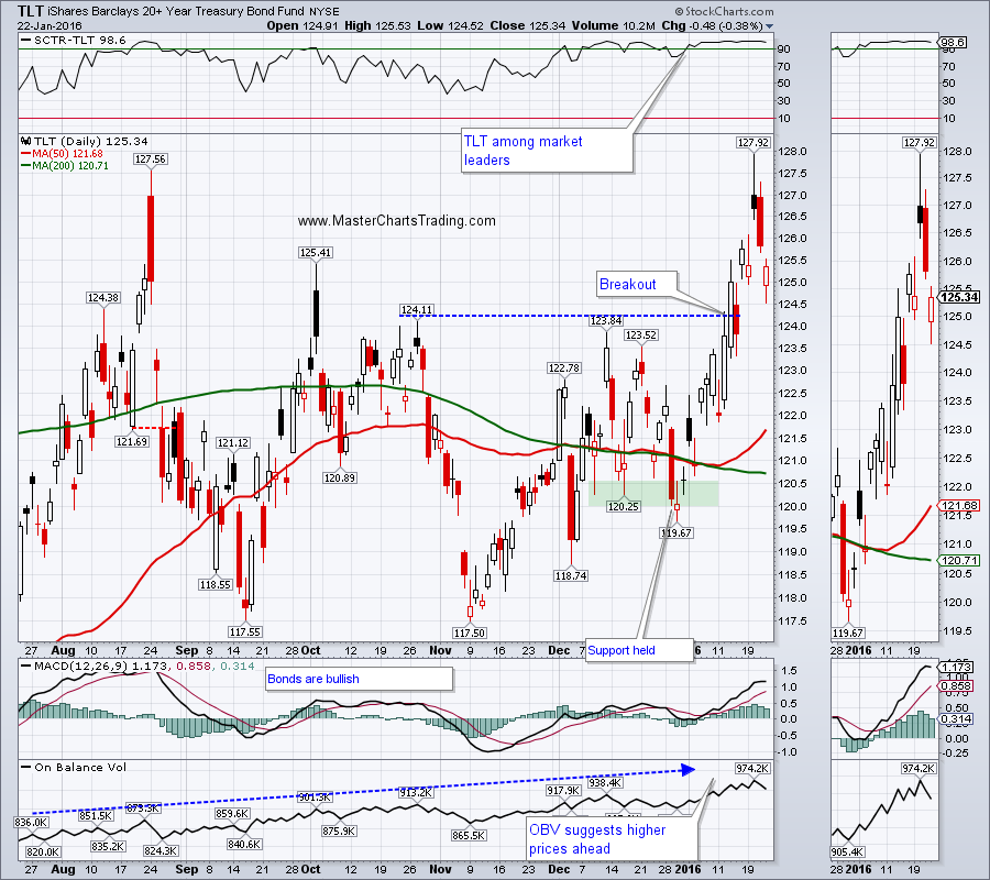
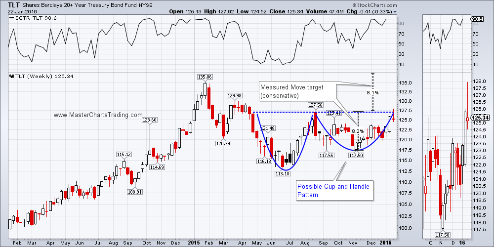
Both bonds and stocks rallied hard today. In fact bonds gapped up in the morning and maintained their gaps by day’s end. This further shows that money is seeking safety. There is more then one place you could find safety, but United States Treasuries certainly come to mind. Further downside pressure for stocks would very likely help bonds.
CHART OF TLT
CHART OF TLT
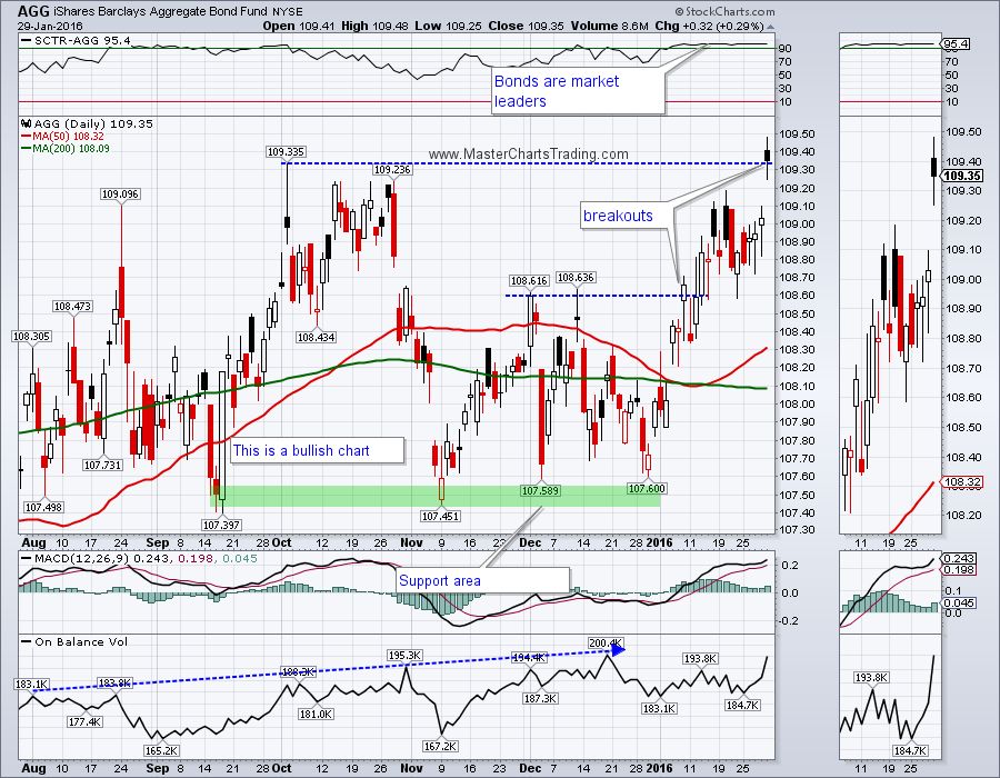
The diversified bonds performed even better then TLT. AGG was able to close above the peak from October, for a possible breakout. AGG is rapidly gaining upon its all-time highs and a breakout above them would call for further upside.
CHART OF AGG
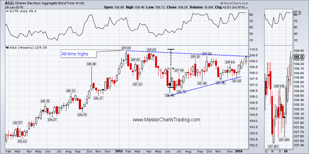
LONG-TERM CHART OF AGG
CHART OF AGG
LONG-TERM CHART OF AGG
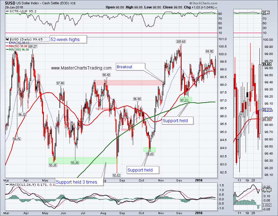
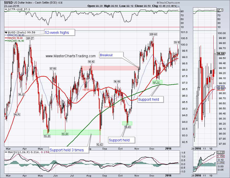
Unsurprisingly the Dollar index gained on Friday against other currencies and especially against the Yen. 52-week highs are close at hand and this will likely weigh on commodities of all sorts. Gold comes to mind.
CHART OF $USD
CHART OF $USD
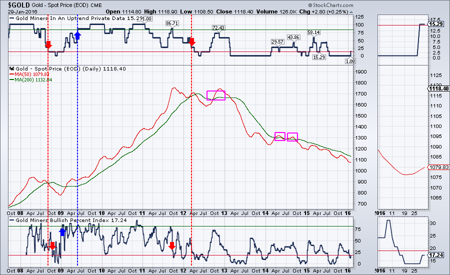
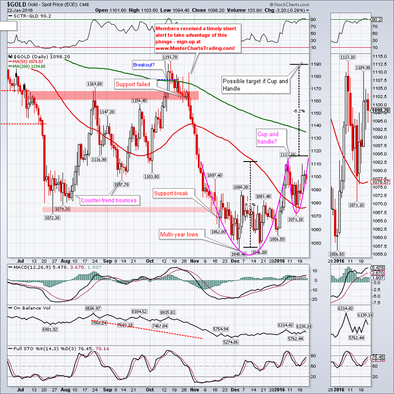
Gold is volatile and rather difficult to trade, so any extra insight into the future of gold price is always welcome. I have been experimenting with various trend and gold miner’s market breadth indicators and came up with first version of my new Gold market breadth indicators (GDXIND). Decent data is available going back to 1995 and the chart below shows price of gold with the actual price removed and the 50 and the 200-day moving averages instead. As you can see GDXIND does a decent job of calling the bull and the bear markets and an OK job eliminating several whipsaws in the long-term trend. This indicator is still experimental, but for now, the trend in gold prices is looking to be firmly down.
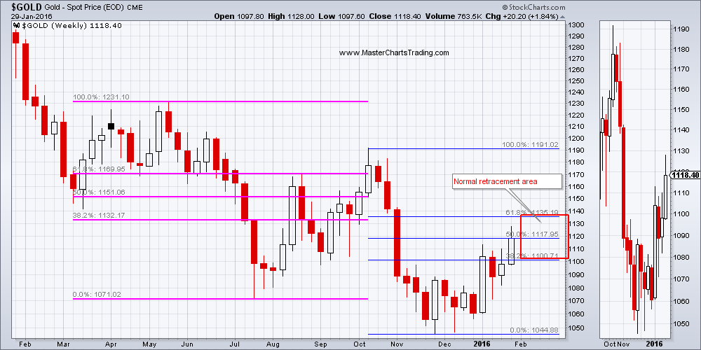
The long-term weekly chart of gold below shows lower lows and lower highs being made – a trademark of a bear market. The latest rebound is currently in the Fibonacci retracement area off the lows set in November of last year. This would be a good place to look for a failure for gold prices.
LONG-TERM CHART OF GOLD
Very short-term, the daily charts of gold shows a possible cup and handle pattern with a breakout target around 1190. Should this cup and handle play out, I will need to re-assess my bearish posture.
GOLD CHART
GOLD CHART
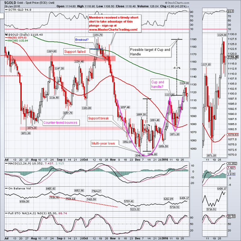
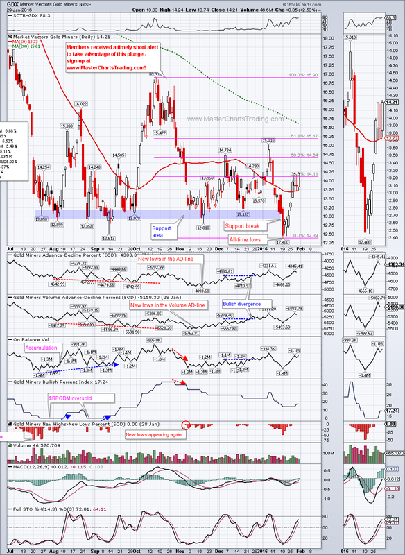
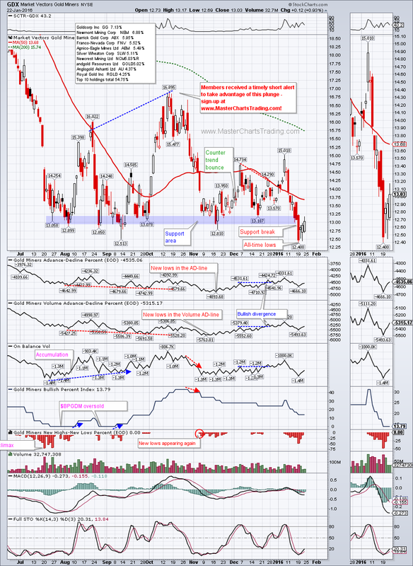
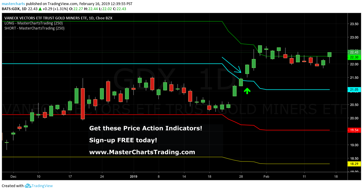
Chart of GDX shows a similar pattern of Fibonacci retracement with a 61.8% retracement in the $15 area – the same area of a previous peak from January high. This is also a good place for GDX to fail.
CHART OF GDX
CHART OF GDX
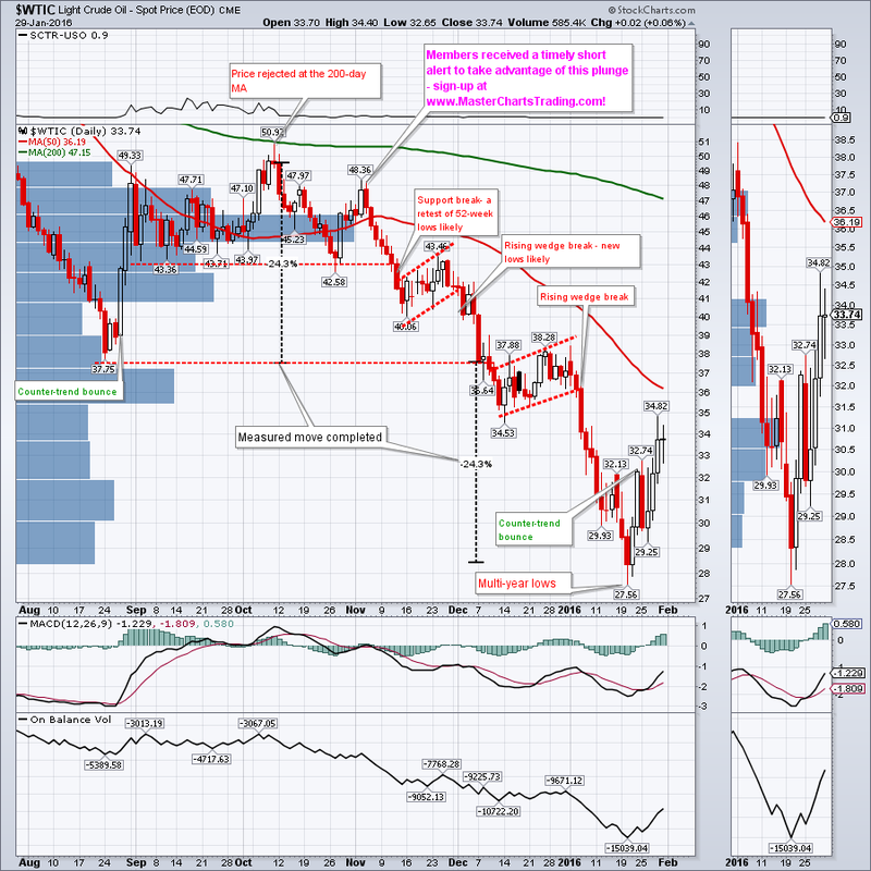
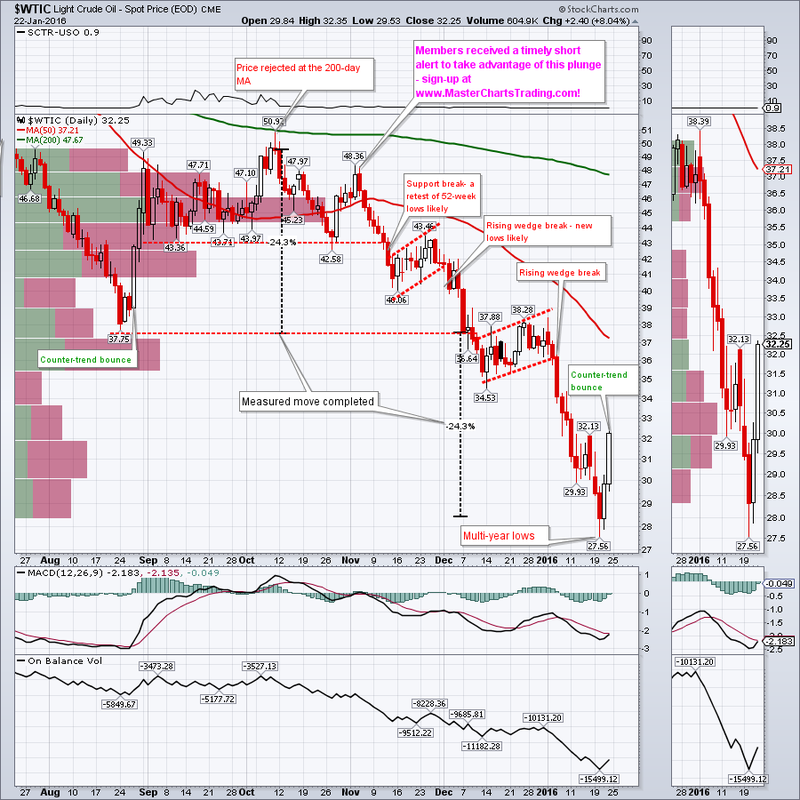
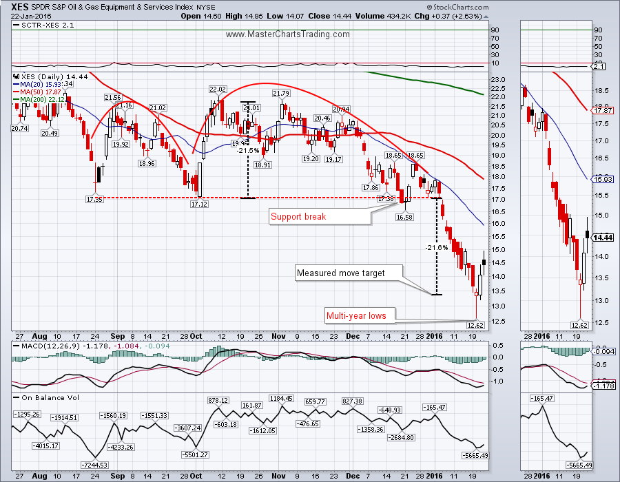
Oil is in the middle of an oversold bounce. My best guess is that shorts will come in around $36 and attempt to push the prices lower. Should this area hold, oil could rally the next high-volume resistance area around $46. Long-term oil is still bearish, so its not on my radar to go long any time soon.
CHART OF $WTIC
CHART OF $WTIC
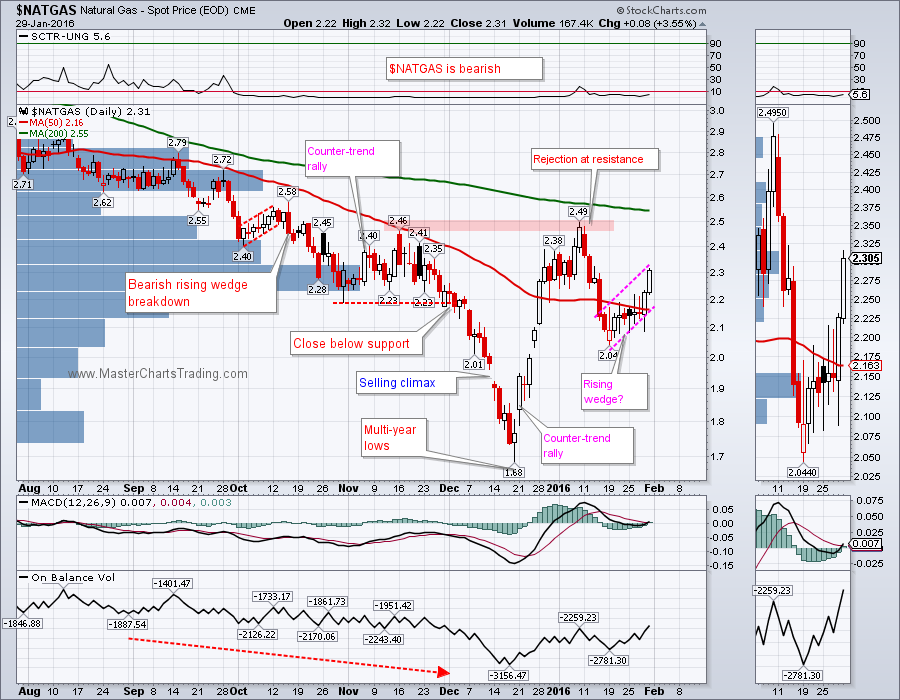
I got several questions from my subscribers regarding NATGAS today. Below is my answer:
“NATGAS is super volatile and trading the triple leveraged DGAZ is kind of like riding a racing motorcycle – it’s very exciting, but also very dangerous. If you haven’t yet watched my psychology of trading videos in the member’s section, please do so soon here: http://www.masterchartstrading.com/login.html
1. NATGAS is not for everyone. Compared to stocks and bonds, I allocate a rather small part of my account to trading NATGAS (and other commodities)
2. A loss should not hurt your portfolio and position sizing is of extreme importance. "
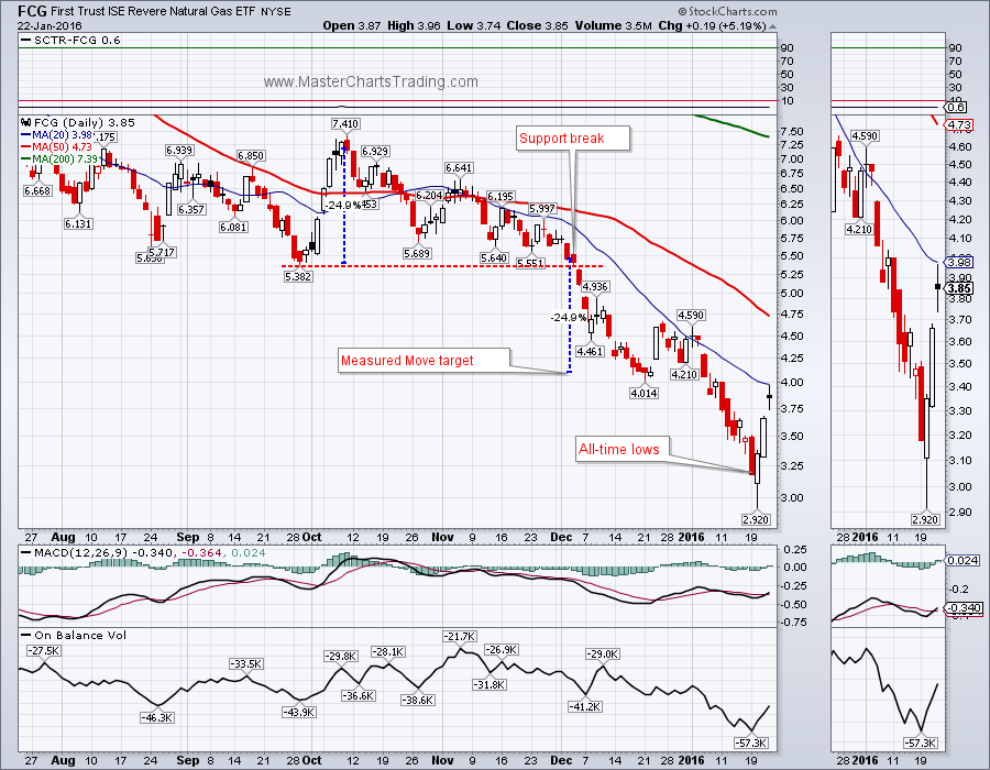
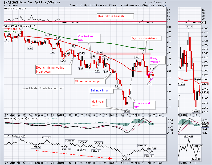
NATGAS fall hard to $2.04, then started rising in what I think is a rising wedge formation. A rising wedge in a bearish security, like NATGAS, is a bearish continuation pattern. A close below the trend line, would almost certainly call for at least a retest of multi-year lows. NATGAS is currently at the high-volume resistance area, so a failure here is likely.
CHART OF NATGAS
“NATGAS is super volatile and trading the triple leveraged DGAZ is kind of like riding a racing motorcycle – it’s very exciting, but also very dangerous. If you haven’t yet watched my psychology of trading videos in the member’s section, please do so soon here: http://www.masterchartstrading.com/login.html
1. NATGAS is not for everyone. Compared to stocks and bonds, I allocate a rather small part of my account to trading NATGAS (and other commodities)
2. A loss should not hurt your portfolio and position sizing is of extreme importance. "
NATGAS fall hard to $2.04, then started rising in what I think is a rising wedge formation. A rising wedge in a bearish security, like NATGAS, is a bearish continuation pattern. A close below the trend line, would almost certainly call for at least a retest of multi-year lows. NATGAS is currently at the high-volume resistance area, so a failure here is likely.
CHART OF NATGAS
Trade Alerts Service is now live – please sign-up here!
That’s it for this week’s market recap,
Best Regards and have another great trading week!
Alexander Berger (www.MasterChartsTrading.com)


 RSS Feed