|
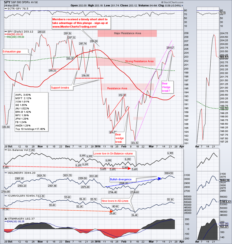
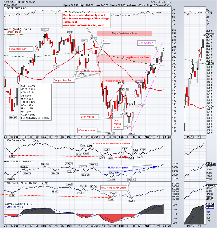
Stocks (SPY) were basically flat for the week, but the resilience of bulls cannot be denied. So far any major attempt by the bears to push the prices lower were met with buyers stepping in. SPY features a giant rising wedge as prices rallied off the 52-week lows in February. The difficulty lies in determining exactly where the trading robots are drawing the invisible lines in the sand we call the trend lines.
|
|
There are many ways you could draw this rising wedge: off the lows/highs, touching as many points as possible, or as few as possible, or alternatively use the close only chart. You get my difficulty? If we take the Friday’s low as the lower part of the wedge, then we have not yet broken the wedge…
CHART OF SPY
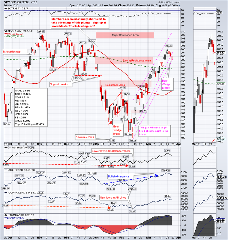
… if we draw using the close-only chart, then the wedge looks like it was broken on Thursday.
CLOSE ONLY CHART OF SPY
CHART OF SPY
… if we draw using the close-only chart, then the wedge looks like it was broken on Thursday.
CLOSE ONLY CHART OF SPY
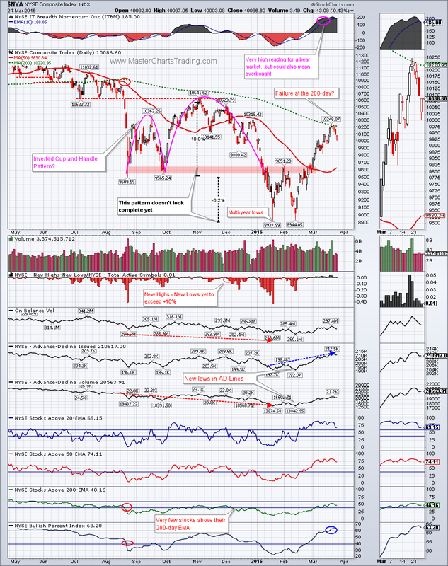
NYSE composite chart is showing a potential failure at the 200-day moving average. The price touched it last Friday and bounced back all this week. An important test would be to see if $NYA can now quickly reverse the losses and rally above the 200-day. If not, and price is again rejected, we could finally see the general markets roll-over and head for a retest of multi-year lows set in February. Failure there would be very bearish.
Market breadth did improve significantly from the beginning of the year. Specifically the AD-Line and the Bullish Percent indices for $NYA are now in the bullish territory. But as I have been pointing out, the volume has been lacking on this rally and the percent of stocks above the 200-day exponential moving average for $NYA is still below 50%. This needs to improve further for me to even contemplate a switch in posture from bearish to bullish.
CHART OF $NYA
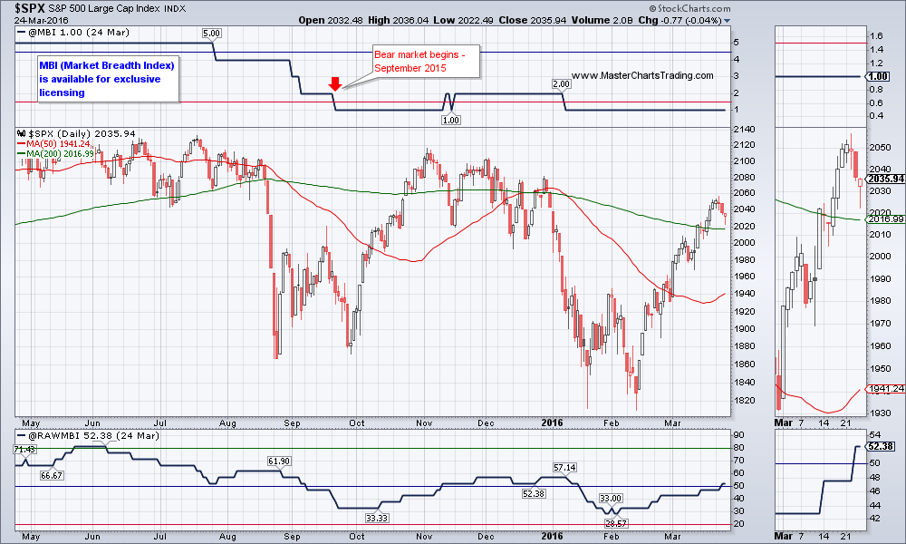
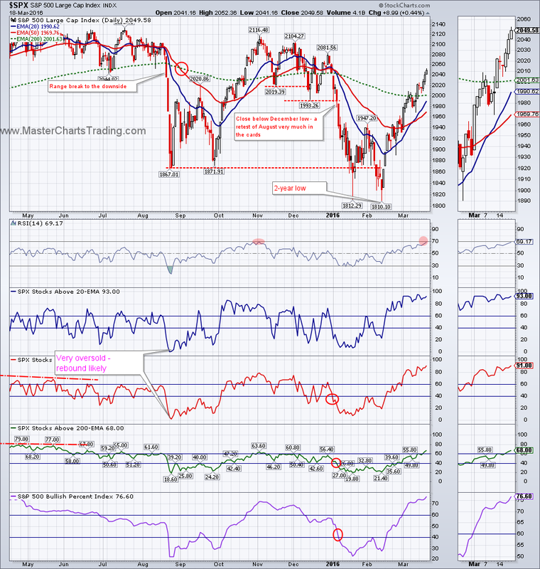
Many of the market commentators are quite rosy about the outlook for the stock market. My long-term model (MBI) has flipped into the bear mode as early as September of last year and is yet to even begin improving. This could all change at any time.
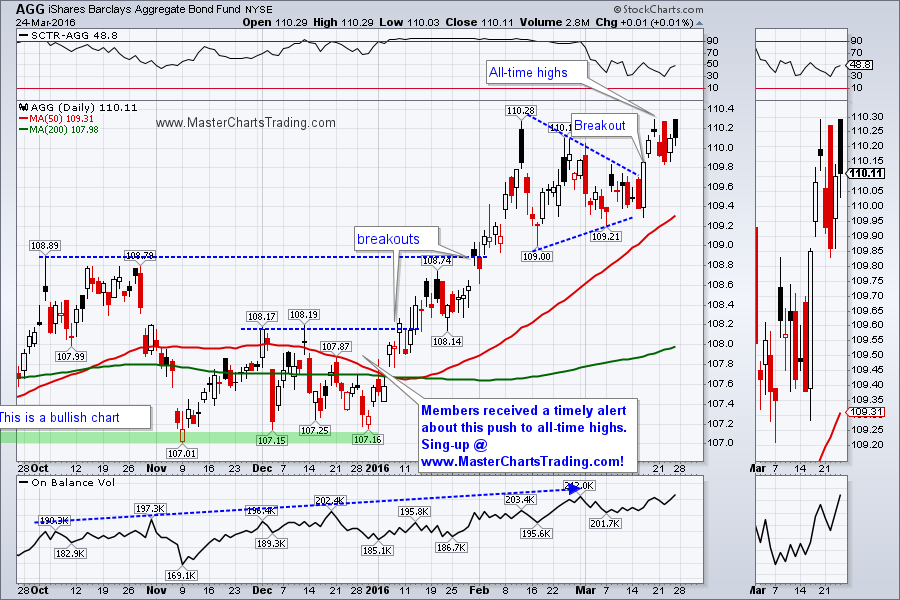
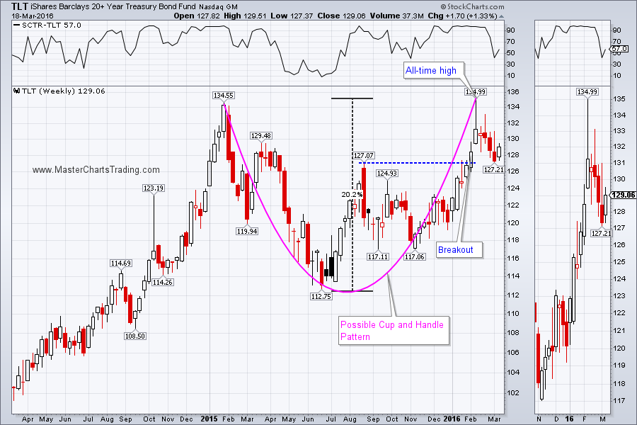
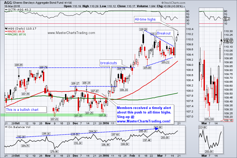
If, as many commentators point out, the picture is rosy, why then are bonds hitting all-time highs, as stocks struggle? In fact, diversified bond fund, AGG, just hit an all-time high this week. In my opinion this is showing elevated levels of fear, as investors are jockeying to get into position to prepare for more downside in stocks.
CHART OF AGG
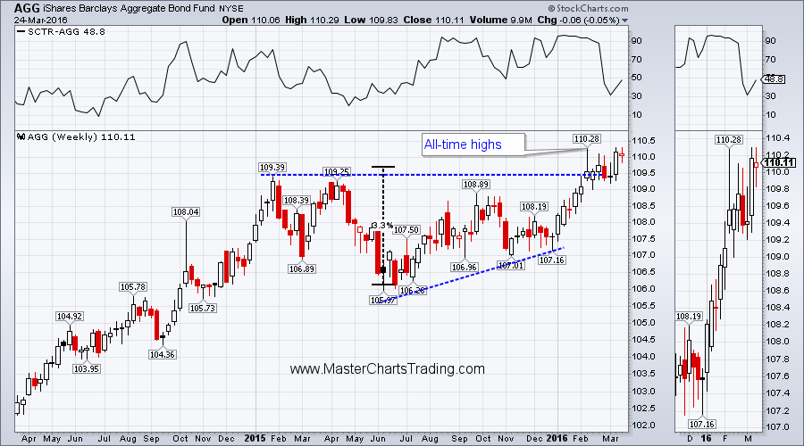
Long-term AGG is looking rather bullish too. From the chart patterns I can see that AGG could easily move up around 3% or more. Should this come to pass, it would be rather bearish for stocks.
LONG-TERM CHART OF AGG
CHART OF AGG
Long-term AGG is looking rather bullish too. From the chart patterns I can see that AGG could easily move up around 3% or more. Should this come to pass, it would be rather bearish for stocks.
LONG-TERM CHART OF AGG
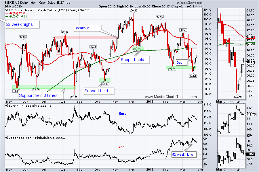
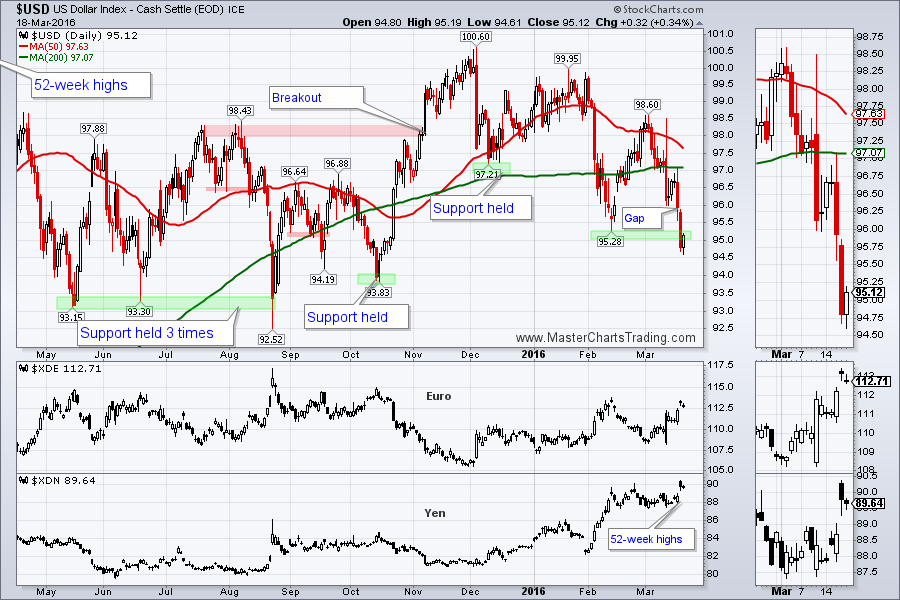
The Dollar strengthened against many other currencies, especially the Yen and the Euro. This put some serious pressure on the commodities complex and called into question gold and oil’s short-term uptrends.
CHART OF $USD
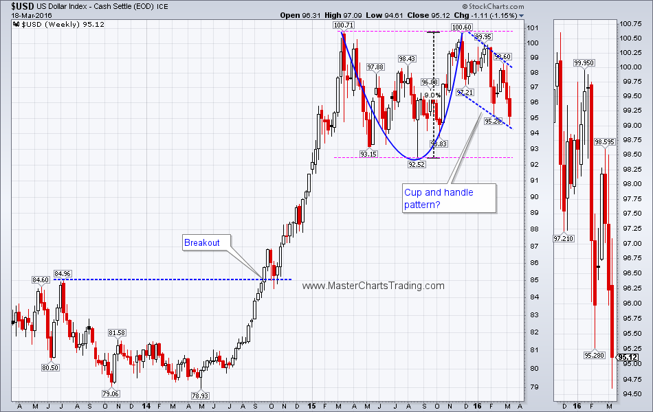
Long-term $USD needs to break out above 100 or break down below 92 to clarify the picture. A breakout would pressure commodities very strongly, while the breakdown, would help them, gold especially.
LONG-TERM CHART OF $USD
CHART OF $USD
Long-term $USD needs to break out above 100 or break down below 92 to clarify the picture. A breakout would pressure commodities very strongly, while the breakdown, would help them, gold especially.
LONG-TERM CHART OF $USD

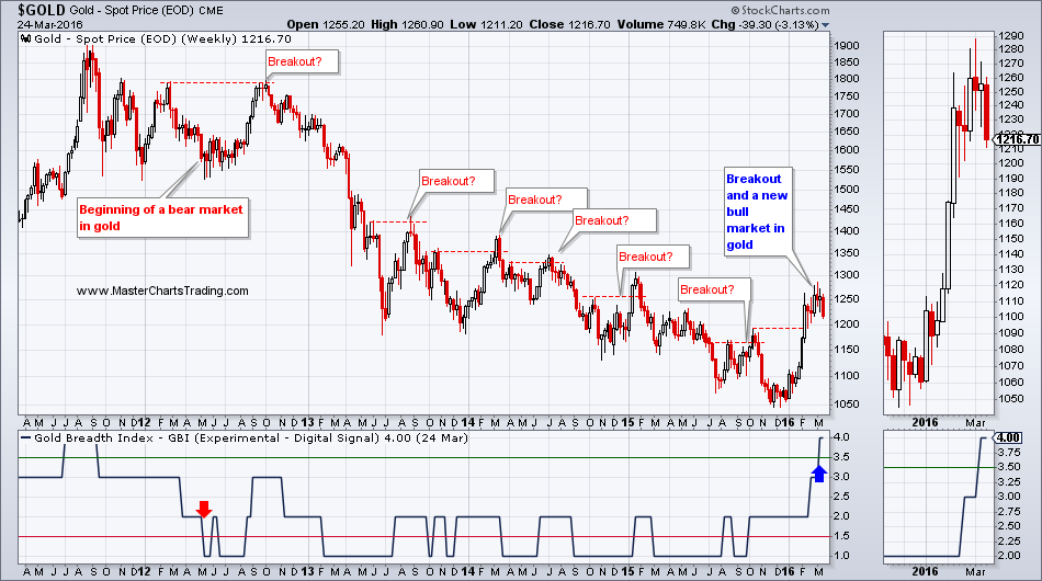
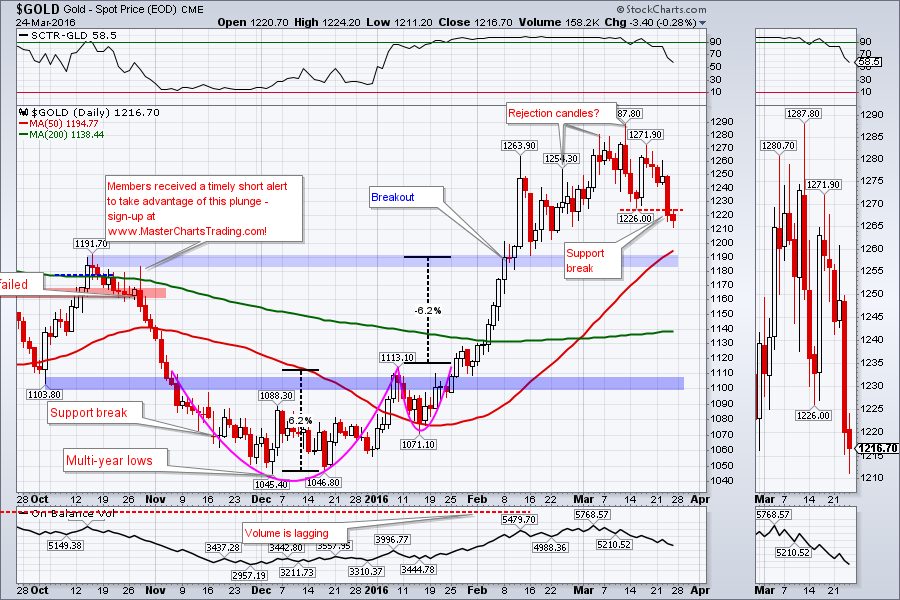
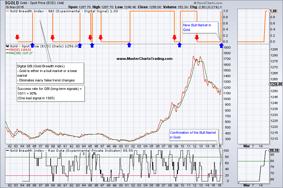
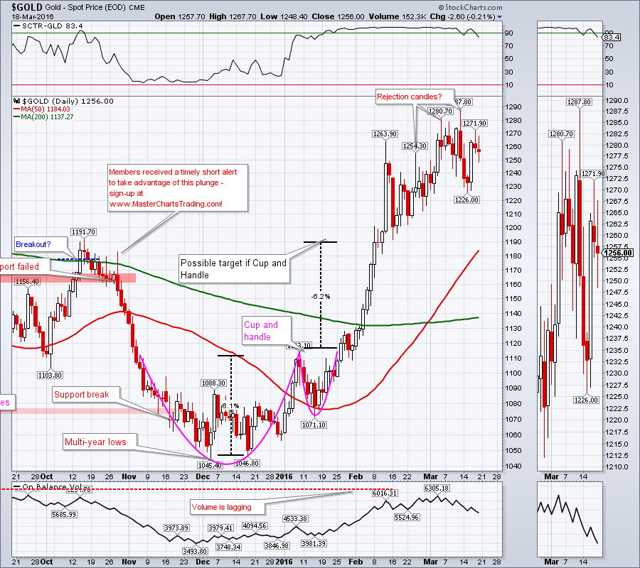
Strength in dollar is weighing on gold. On Thursday gold may have broken a minor support at around $1226 and so far was not able to recapture. Last week I mentioned that my long-term gold model (GBI) has flipped into a bull market and I am now looking to buy gold and to trade it on the upside.
LONG-TERM CHART OF GOLD
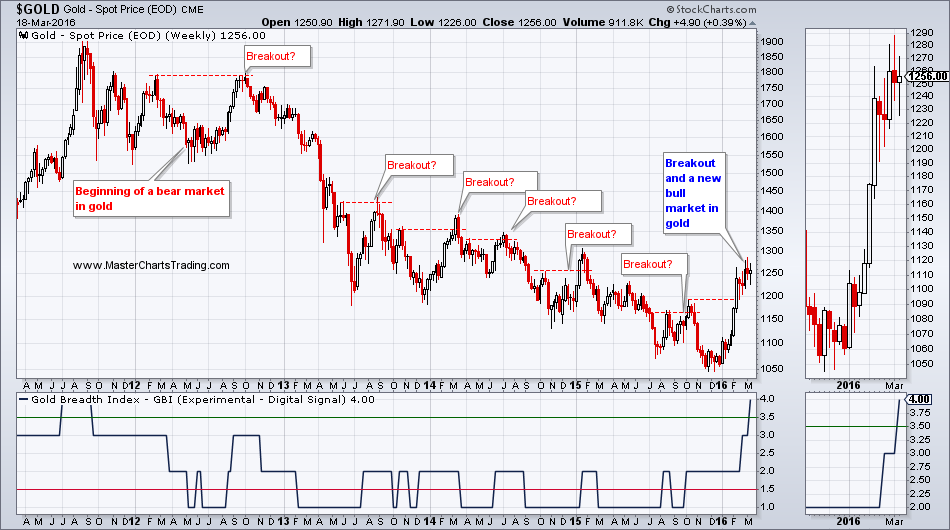
This pullback, which is looking like it is going to materialize, is going to be an important test of the validity of this breakout. A failure in the $1800 area, could give way to a trip down to the $1100 area. A failure there may mean that this breakout has failed completely and we would be back to our regularly scheduled bear market in gold.
GOLD CHART
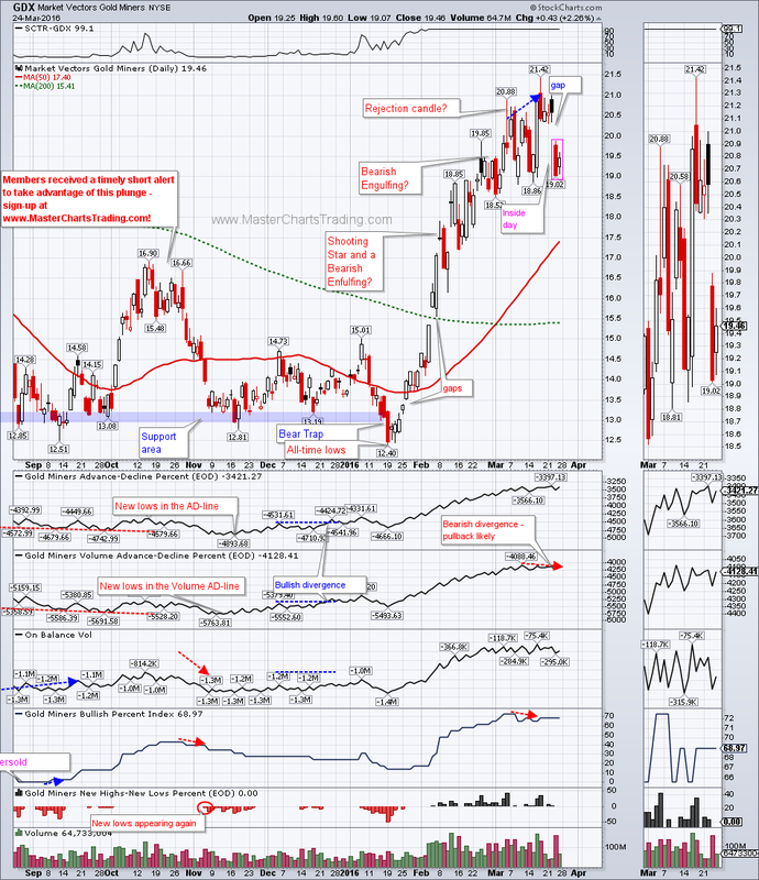
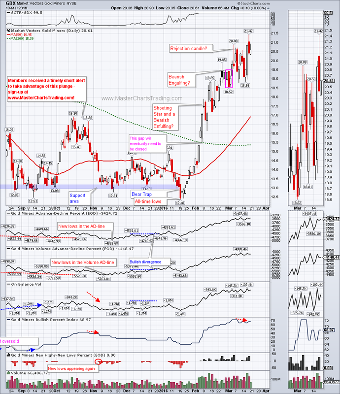
Gold miners are following gold lower over the last two days, but in their usual volatile manner. There are now multiple unfilled gaps on GDX chart. The big question remains which once will get filled first? If gold pulls back, it could be the once down below around $15.5 or even around $13.50. As you can imagine a gap fill in the $13 are would pretty much imply a complete failure of the new bull market in gold.
CHART OF GDX
LONG-TERM CHART OF GOLD
This pullback, which is looking like it is going to materialize, is going to be an important test of the validity of this breakout. A failure in the $1800 area, could give way to a trip down to the $1100 area. A failure there may mean that this breakout has failed completely and we would be back to our regularly scheduled bear market in gold.
GOLD CHART
Gold miners are following gold lower over the last two days, but in their usual volatile manner. There are now multiple unfilled gaps on GDX chart. The big question remains which once will get filled first? If gold pulls back, it could be the once down below around $15.5 or even around $13.50. As you can imagine a gap fill in the $13 are would pretty much imply a complete failure of the new bull market in gold.
CHART OF GDX
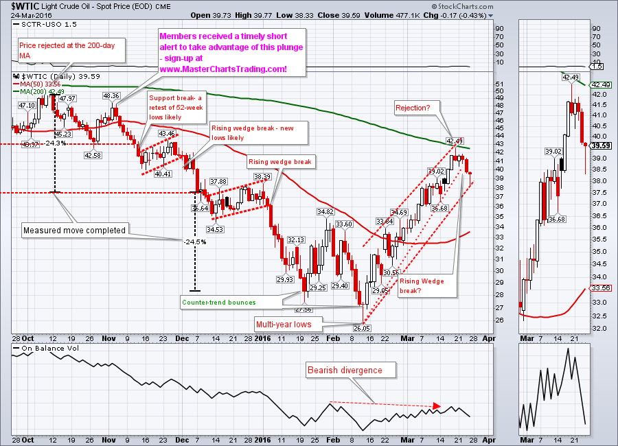
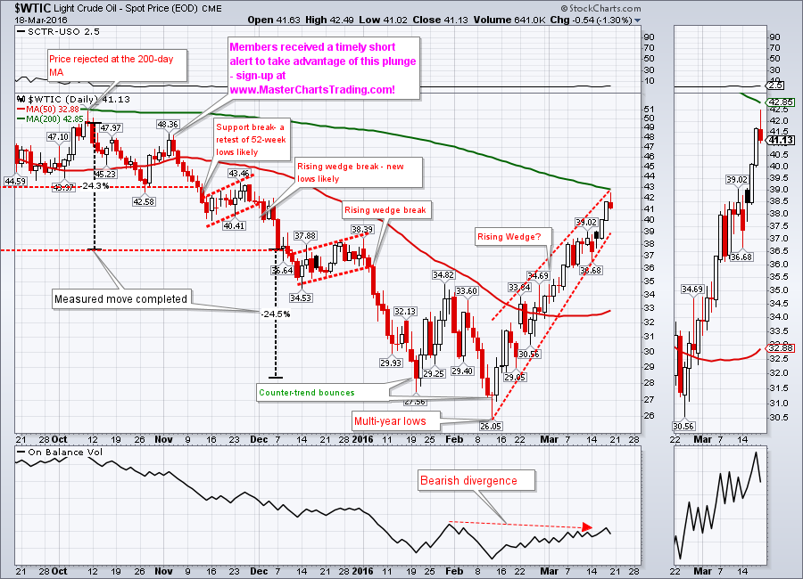
Oil was also rising in a wedge-like pattern together with stocks. Oil has been highly correlated to the stock market of late. I think it’s a spurious correlation, but robots do pay attention to these short-term correlations, so we should heed them as well. As with my SPY example above, it is sometimes difficult to draw trend lines. This is why chart patterns are secondary in my analysis and I pay more heed to the quantifiable variables. There is also a possible rejection candle from last Friday’s action at the 200-day moving average. A close below this Thursday’s low would most likely break this pattern and we could see a trip down to multi-year lows again.
CHART OF $WTIC
CHART OF $WTIC
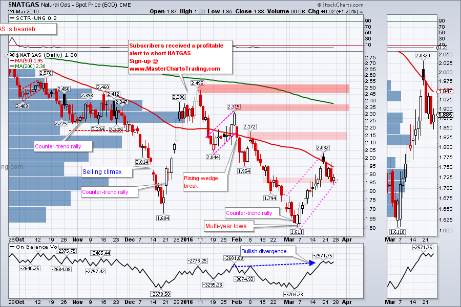
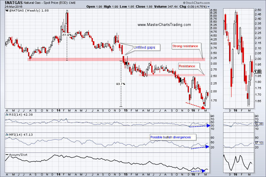
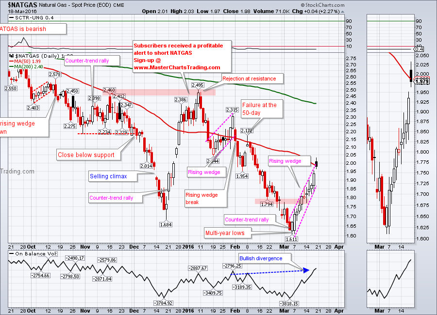
Natural gas bounced back from multi-year lows in the beginning of March also in form of a possible rising wedge. NATGAS was able to pierce through some weak resistance at $1.90, but so far hasn’t been able to close above the 50-day moving average. I drew in several resistance levels around 2.15, 2.35 and 2.50.
CHART OF NATGAS
The 2.50 level is of a particular importance because it is around there that NATGAS failed last September. It is also around 2.50 where the price was rejected in January. Currently there several bullish divergences present on the long-term chart of NATGAS (price made a lower low, but indicators made higher lows).
As of the writing of this blog post, I still consider NATGAS a bearish security and by extension only looking for short setups. Should NATGAS manage to break above 2.50 and hold on a retest my posture would change to a bullish one.
LONG-TERM CHART OF NATGAS
Trade Alerts Service is now live – please sign-up here!
That’s it for this week’s market recap,
Best Regards and have another great trading week!
Alexander Berger (www.MasterChartsTrading.com)
That’s it for this week’s market recap,
Best Regards and have another great trading week!
Alexander Berger (www.MasterChartsTrading.com)


 RSS Feed