|
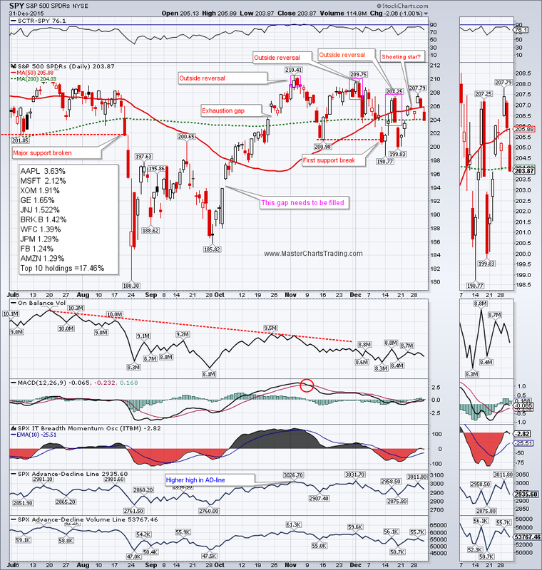
SPY ran into resistance, as if on cue, in the $208 area on Wednesday. The ETF then gapped down on Thursday and ended the week below its 200-day moving average (MA). This is decidedly not what the bulls want to see happen, especially during one of the most bullish seasonal periods of the year. Next few days should be crucial: the bulls must now make a stand, or we may see a confirmation of the support break below the November lows.
CHART OF SPY |
|
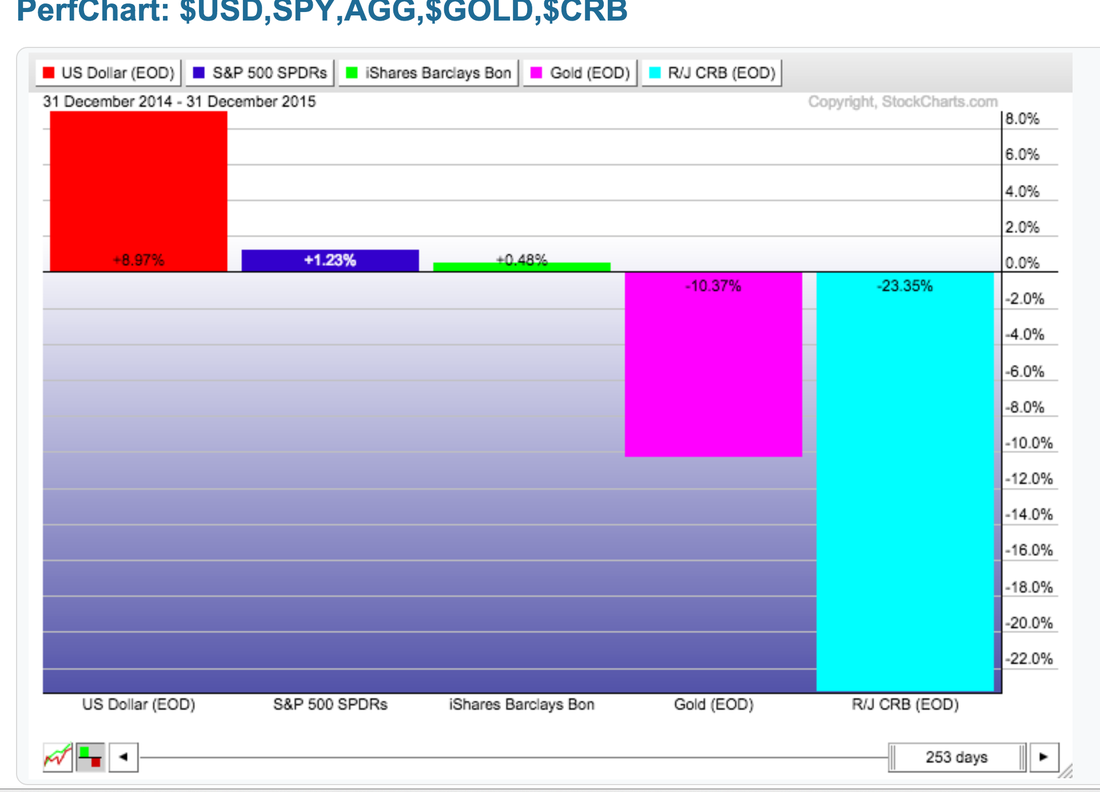
2015 has been one of the more difficult years for both investors and traders. If you are a buy and hold type of investor, then holding cash would have resulted in the best performance as the $USD gained almost 9% against other currencies. Other asset classes performed poorly: SPY (with dividends) up just over 1%, AGG (with dividends) up a fraction of a percent, while gold and diversified commodities were both down big for the year.
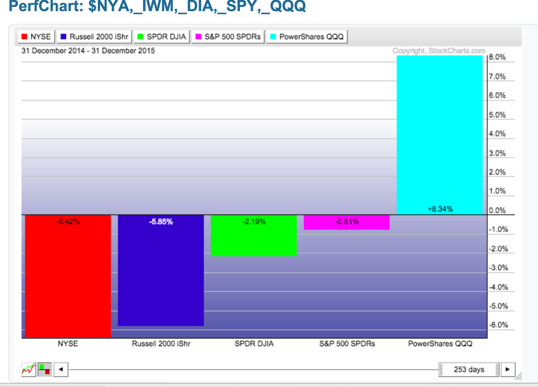
Looking further within stocks, it has been clearly a large-cap technology market. QQQ (without dividends) is up over 8%, while the rest of the major ETFs are down for the year, with small-caps taking the brunt of the selling.
Looking further within stocks, it has been clearly a large-cap technology market. QQQ (without dividends) is up over 8%, while the rest of the major ETFs are down for the year, with small-caps taking the brunt of the selling.
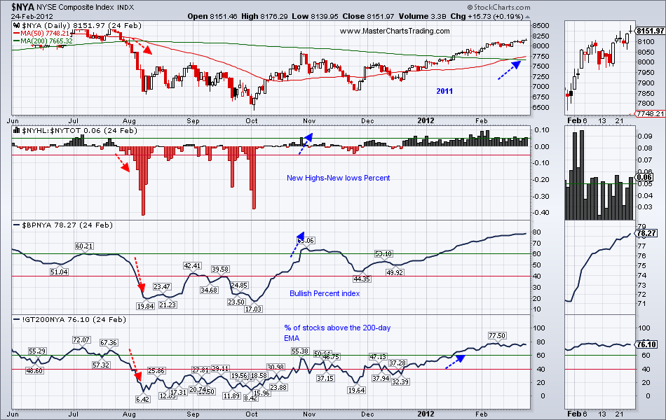
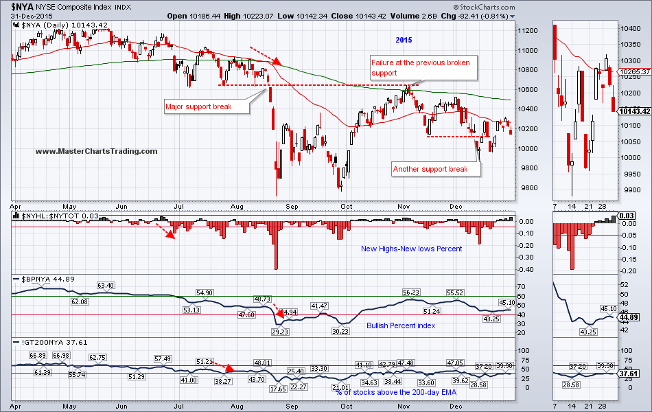
Some of the favorite past-times this year was attempting to compare 2015 to 2011. As I repeatedly mentioned in my previous blog posts and videos, I don’t think 2011 was anything like 2015. For the sake of consistency, lets try and compare the two time periods again.
Please refer to the next two charts for the discussion.
The charts have 4 indicators on them:
1. 50-day and the 200-day moving averages
2. Percent New Highs – New Lows
3. Bullish percent index
4. Percent of stocks above the 200-day exponential moving average
Notice that in 2011 NYA had a bearish moving average cross that was followed by the rest of the indicators turning bearish. It then took around 60 trading days for the first pair of indicators to turn bullish again. 110 Trading days later the third indicator turned bullish. Finally 132 trading days later we got a bullish moving average cross.
What about 2015 to present?
First of all the bearish moving average cross was preceded by the New Highs-New lows percent bearish flip almost 2 month prior, and by the Percent of stocks above the 200-day EMA 1 month prior. As of the writing of this blog post on January 1, 2016, zero of the above mentioned indicators have turned bullish, and we are already 95 trading sessions following the bearish moving average cross.
In conclusion: the current market picture is significantly weaker then that which occurred in 2011.
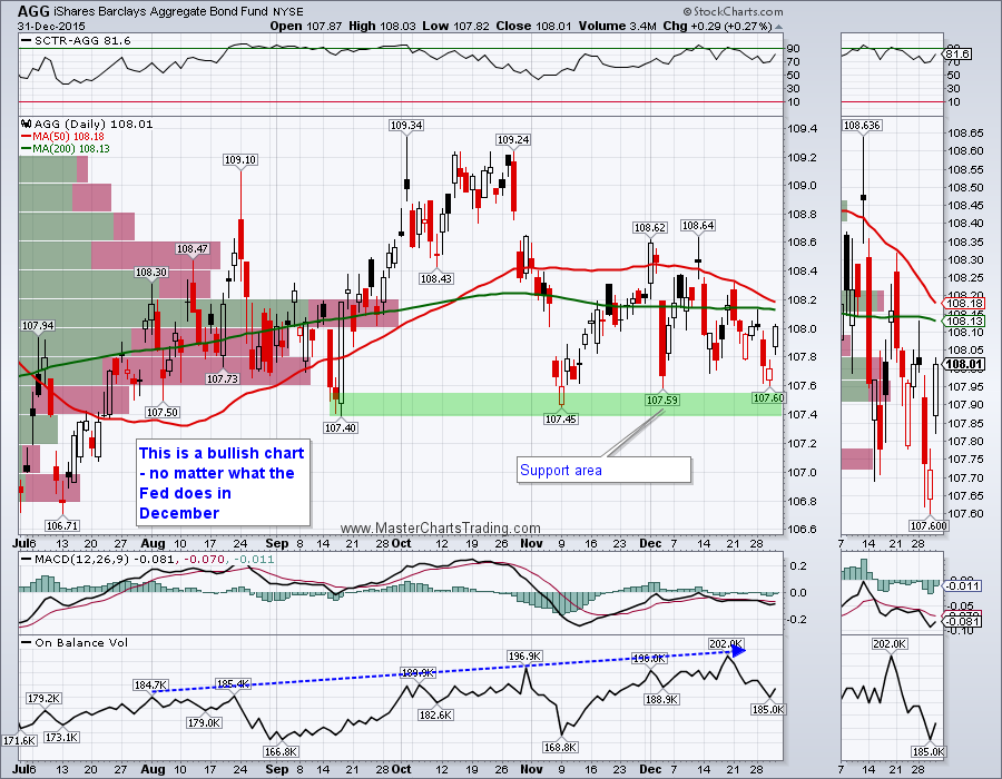
Moving on to the fixed income universe.
I think the bonds (AGG) have again held support in the $107.50 area and are in the process of rebounding. If AGG manages to break above the high volume resistance around $108, the door will be open to challenge the recent highs of around $109 or higher.
CHART OF AGG
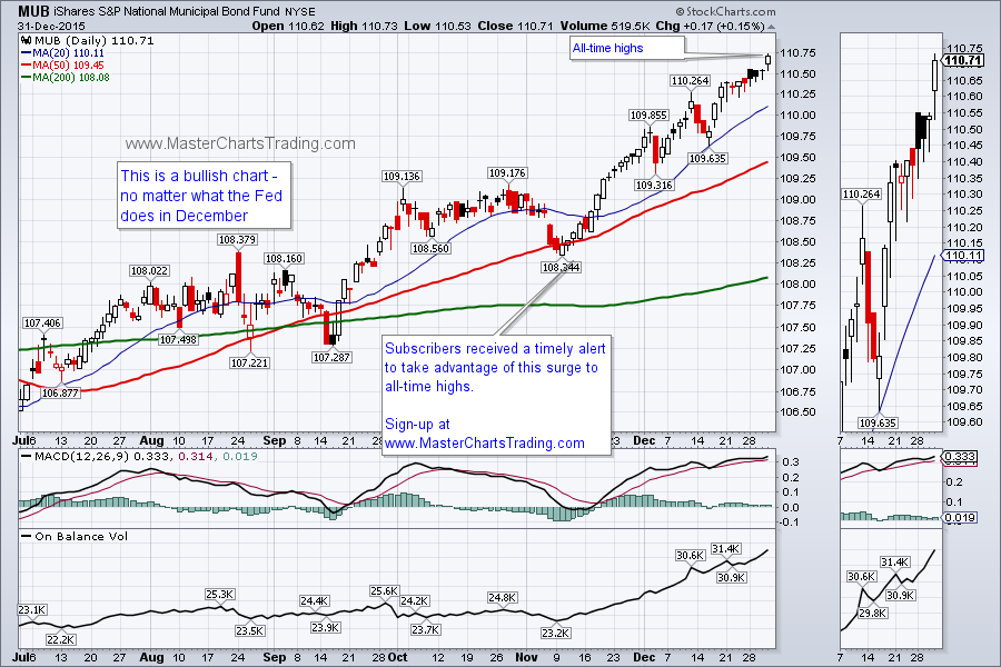
Municipal bonds (MUB) again hit another all-time high this week. To me this looks like a clear case of a rotation away from stocks and into other asset classes. Should stocks come under more selling, bonds are likely to benefit further.
CHART OF MUB
I think the bonds (AGG) have again held support in the $107.50 area and are in the process of rebounding. If AGG manages to break above the high volume resistance around $108, the door will be open to challenge the recent highs of around $109 or higher.
CHART OF AGG
Municipal bonds (MUB) again hit another all-time high this week. To me this looks like a clear case of a rotation away from stocks and into other asset classes. Should stocks come under more selling, bonds are likely to benefit further.
CHART OF MUB
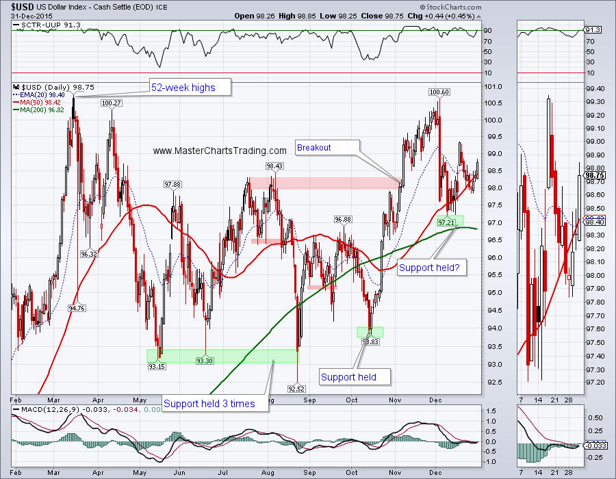
The Dollar index ($USD) is bullish and very likely held support from a few weeks ago. With the Federal Reserve tightening, while the rest of the world is still easing, the $USD is now very likely going to challenge 52-week highs set in March of last year. This is going to further put pressure on commodities.
CHART OF $USD
CHART OF $USD
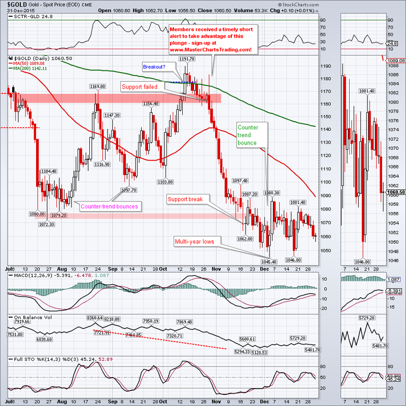
Gold remains mired in a bear market. Just a few weeks ago it hit multi-year lows, but since has rebounded. So far neither the bulls nor the bears are able to dominate action. I am hoping for a sizable rebound, so I can short again. This rebound, if it is going to materialize, could take gold to as high as $1100 or maybe even all the way up to the 200-day MA at around $1140.
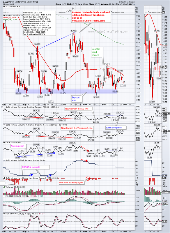
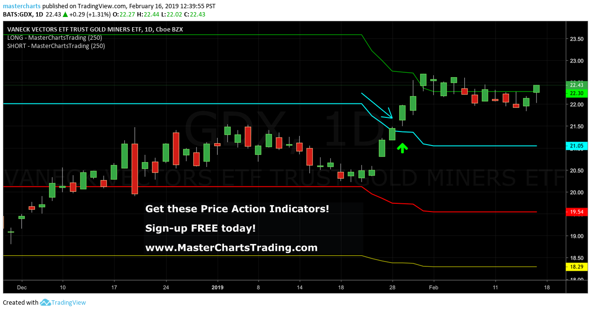
Last week I pointed out a slight bullish divergence on the chart of GDX as the price made a lower high, but the underlying market breadth and volume patterns made a higher high. This week there was no follow-through, but this divergence remains in play still. We could still see a short-term rebound to a rather wide area defined by the December high and the falling 200-day MA. I will look for signs of failure in that area to short again.
CHART OF GOLD
CHART OF GD
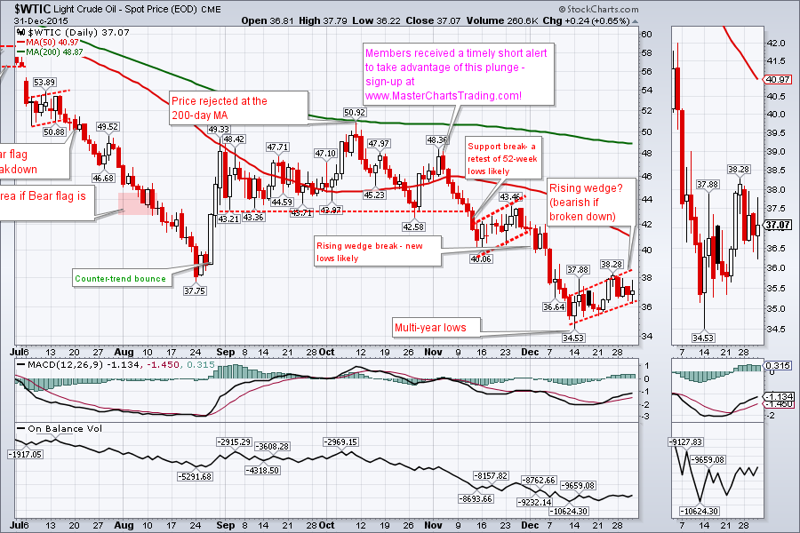
Following a sharp support break in December, oil is now trading in what looks like a rising wedge formation. Rising wedges in a bearish security, like oil, are continuation patterns. If/when the wedge formation is broken to the downside, we could see a sharp move even lower. Short-term rising wedges are bullish, while they are still rising. Should this bear wedge break down, we could still see oil trading in the upper $20s
CHART OF OIL
CHART OF OIL
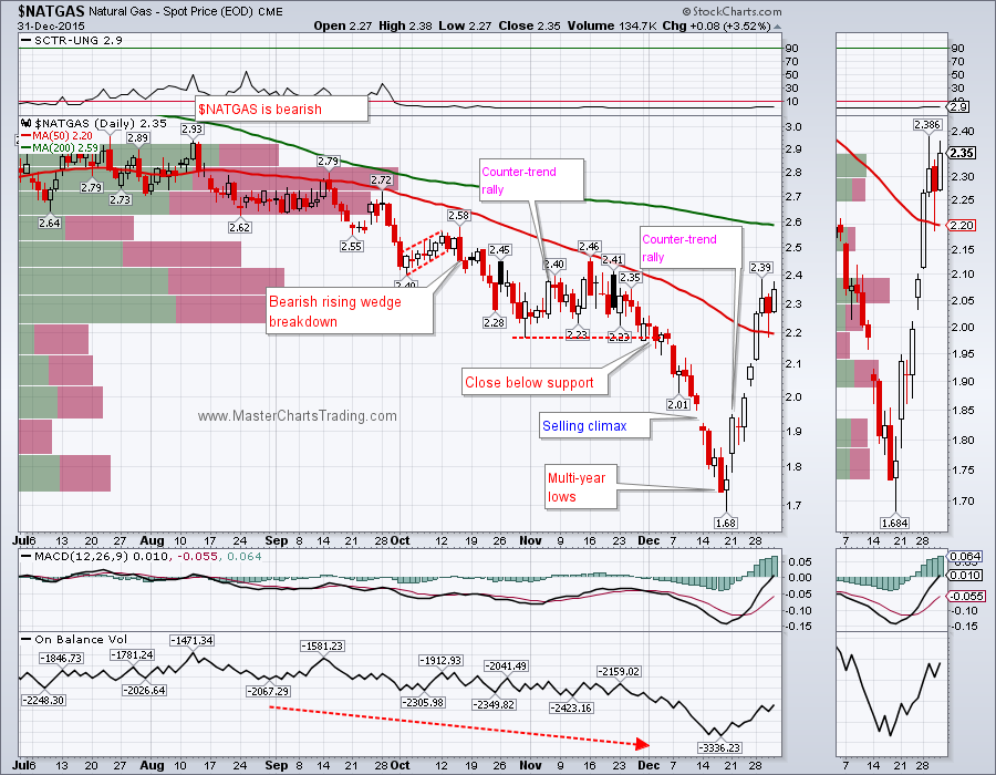
Natural gas seems to be stalling in the $2.40 area and is already overbought after a 42% bear-market rally. Unless it fails right now, NATGAS could bounce higher to the $2.70 area of high-volume resistance. For now I am treating NATGAS as still in a bear market, but anything is possible and maybe the low put in on December 18th was indeed the low for a while.
CHART OF NATGAS
CHART OF NATGAS
That’s it for this week’s market recap,
Best Regards and have another great trading week!
Alexander Berger (www.MasterChartsTrading.com)
P.S. Trade Alerts Service is now live – please sign-up here!


 RSS Feed